With Belvo's Hosted Widget, you can customize and brand the widget in two ways: through your access token request, and through the Custom Widget dashboard tool.
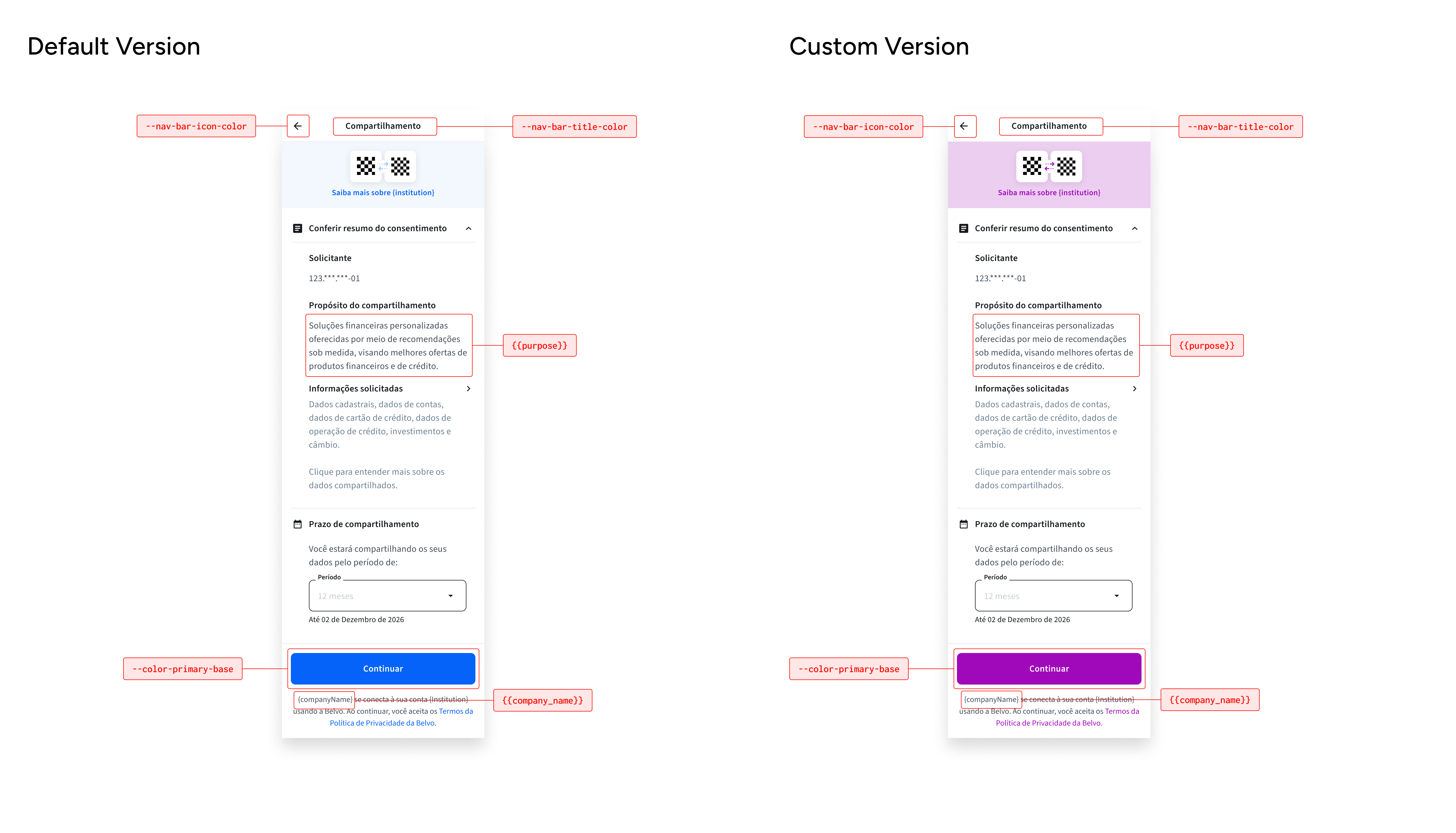
The settings below are sent as JSON in the same backend call as your request to generate an access_token. For a full example of how this looks, see the code example below.
You can add your company icon to the widget to make it more aligned with your brand. When you add your company icon, it appears on the following screen:
- initial start of the widget
Make sure that your icon has square dimensions, in SVG format, has a transparent background, and contains no surrounding whitespace. If your icon does not follow these specifications, the Belvo widget will display the following icon:
Instructions
To add a custom company icon, just add the URL to your SVG image to the company_icon key.
{
  "widget": {
    "branding": {
      ...
      "company_icon": "https://mysite.com/icon.svg",
      ...
        }
     }
}You can add your company logo to the widget to make it more aligned with your brand. When you add your company logo, it appears on the following screens:
- while the account is being linked
- once an account is successfully linked
- when a user chooses to cancel the linking process
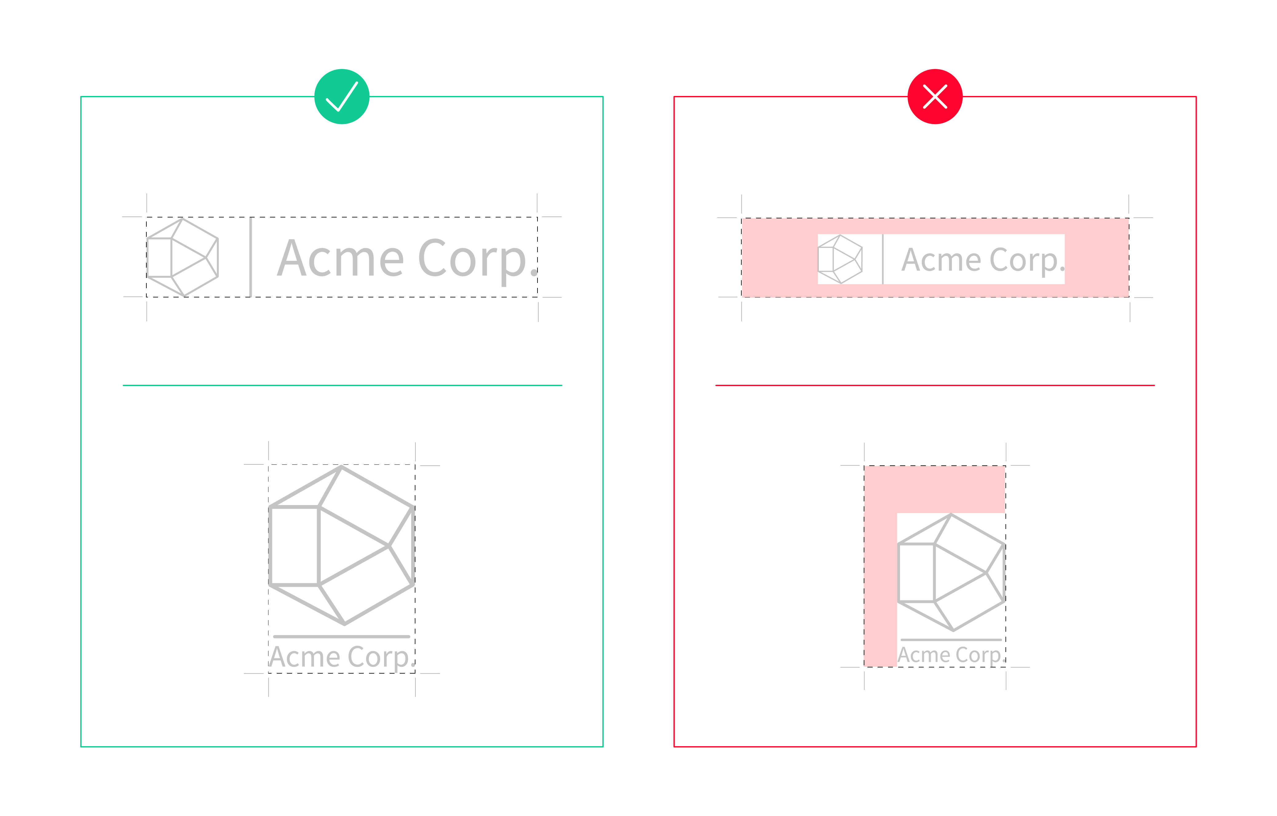
Make sure that your logo is in SVG format, has a transparent background, and contains no surrounding whitespace. For the best visibility and scaling, we suggest that you use a horizontal logo (see the top-left example in the image below).
Instructions
To add a custom company logo, just add the URL to your SVG image to the company_logo key.
{
  "widget": {
    "branding": {
      ...
      "company_logo": "https://mysite.com/logo.svg",
      ...
        }
     }
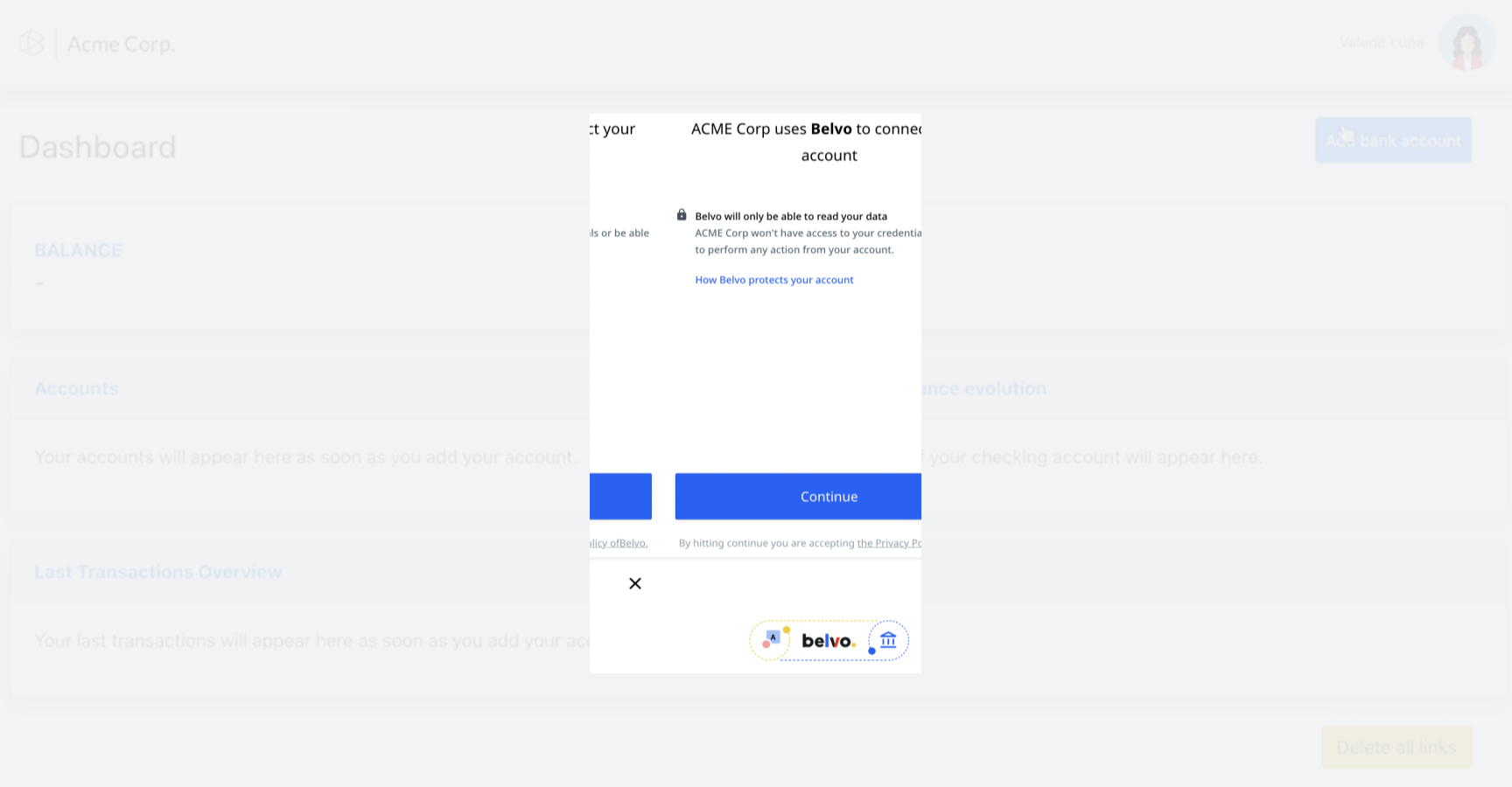
}You can add your company name to be displayed when the widget first starts. By default, it'll just display "Link your account". When you add your company name, the message will follow the format "[company_name] uses Belvo to connect your account".
Please note, only the company name is customizable in the introductory sentence
Instructions
To add your company name, just add it to the company_name key.
{
  "widget": {
    "branding": {
      ...
      "company_name": "ACME",
      ...
        }
     }
}You can choose to display the Belvo logo between your company logo and the institution logo on the initial connect screen. This helps reinforce that Belvo is facilitating the secure connection. By default, this option is set to false, and only your company logo and the institution logo are displayed.
When enabled, the logo layout changes to: [Your Company Logo] → [Belvo Logo] → [Institution Logo]
Instructions
To display the Belvo logo in the middle of the initial connect screen, set the show_belvo_middle_logo parameter to true.
{
  "widget": {
    "branding": {
      ...
      "show_belvo_middle_logo": true,
      ...
    }
  }
}You can modify the text describing the purpose for requesting your user's data (Propósito do compartilhamento) to better describe your use case.
By default, the displayed text is: _Soluções financeiras personalizadas oferecidas por meio de recomendações sob medida, visando melhores ofertas de produtos financeiros e de crédito. _
Instructions
To customize the text describing the purpose for requesting access to your user's data, just add your text (maximum 600 characters) to the purpose key.
{
  "widget": {
    "consent": {
       "purpose": "Your custom text here. Max 600 characters",
       ...
    }
  }
}You can specify the default consent duration (in days) that will be preselected in the consent screen dropdown. This helps streamline the user experience by presenting your preferred consent period as the default option.
The backend supports the following consent duration values:
| Label | Value (days) |
|---|---|
| Indeterminado (Indefinite) | null |
| 12 meses (12 months) | 366 |
| 9 meses (9 months) | 275 |
| 6 meses (6 months) | 183 |
| 3 meses (3 months) | 92 |
How it works:
- If you provide one of the valid values (
366,275,183, or92), that option will be preselected in the consent duration dropdown. - If you don't provide a value or provide a different value, "Indeterminado" (indefinite) will be the preselected option.
- The dropdown list order remains unchanged; only the preselected option changes.
- The widget accepts any positive integer, but only the values listed above correspond to the available consent duration options.
Instructions
To set the default consent duration, add the number of days to the default_consent_duration_days key within the consent object.
{
  "widget": {
    "consent": {
       "default_consent_duration_days": 183
    }
  }
}The default_consent_duration_days parameter is optional and independent of the purpose parameter. You can use them together or separately based on your needs.
For the consent duration to be properly preselected, use one of these values: 366 (12 months), 275 (9 months), 183 (6 months), or 92 (3 months). Any other value will result in "Indeterminado" being preselected.
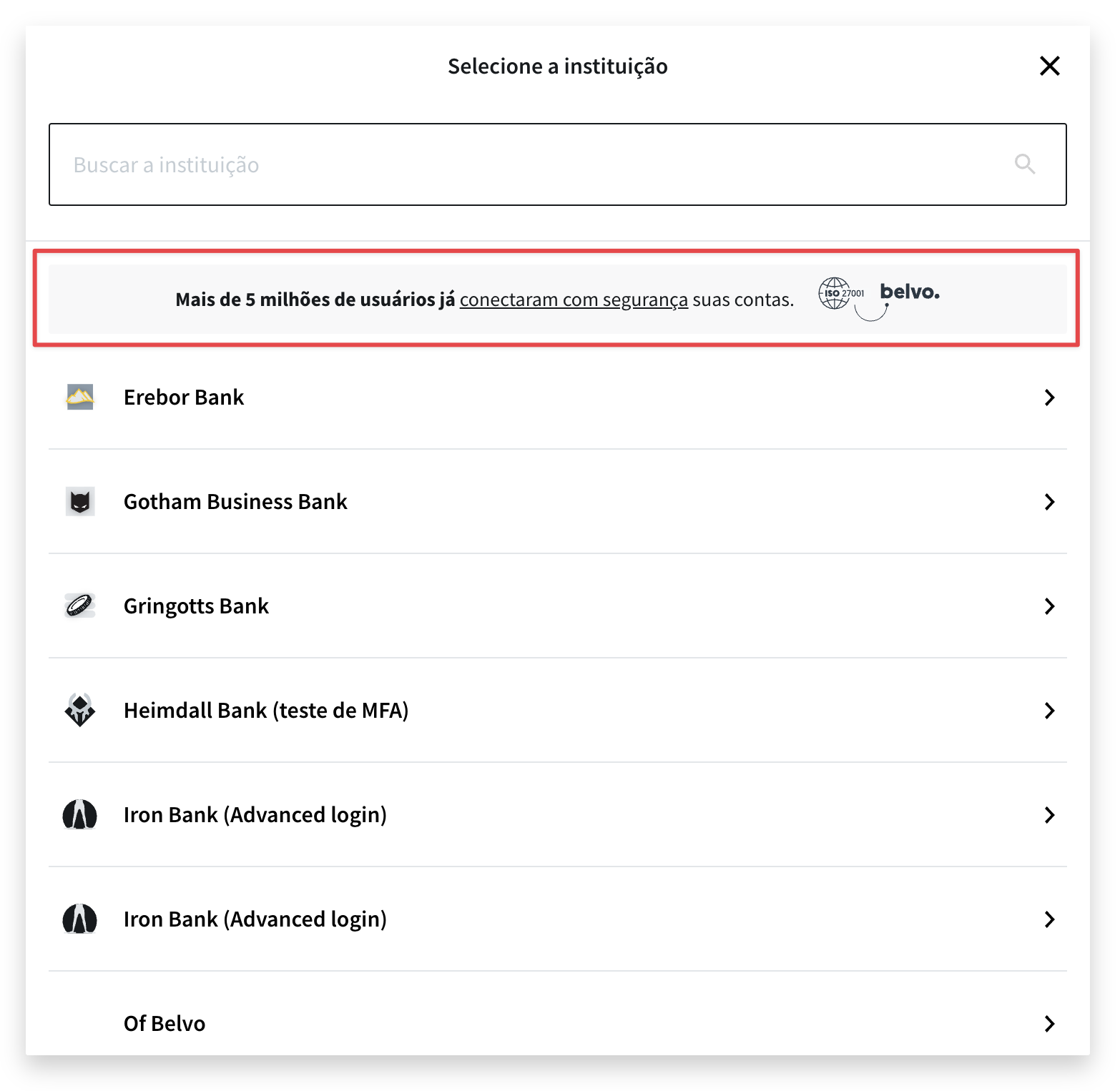
You can choose to hide the "Mais de 5 milhões de usuários já conectaram com segurança suas contas." message that appears when your user selects their institution in the widget. By default, this message is visible in the widget (true).
Instructions
To hide the message in the institution select screen, just set the social_proof parameter to false.
{
  "widget": {
    "branding": {
      ...
      "social_proof": false,
      ...
        }
     }
}CSS variables are configured visually through the Custom Widget tool in your Belvo dashboard.
Instructions
In your Belvo dashboard, go to Developer Tools > Custom Widget.
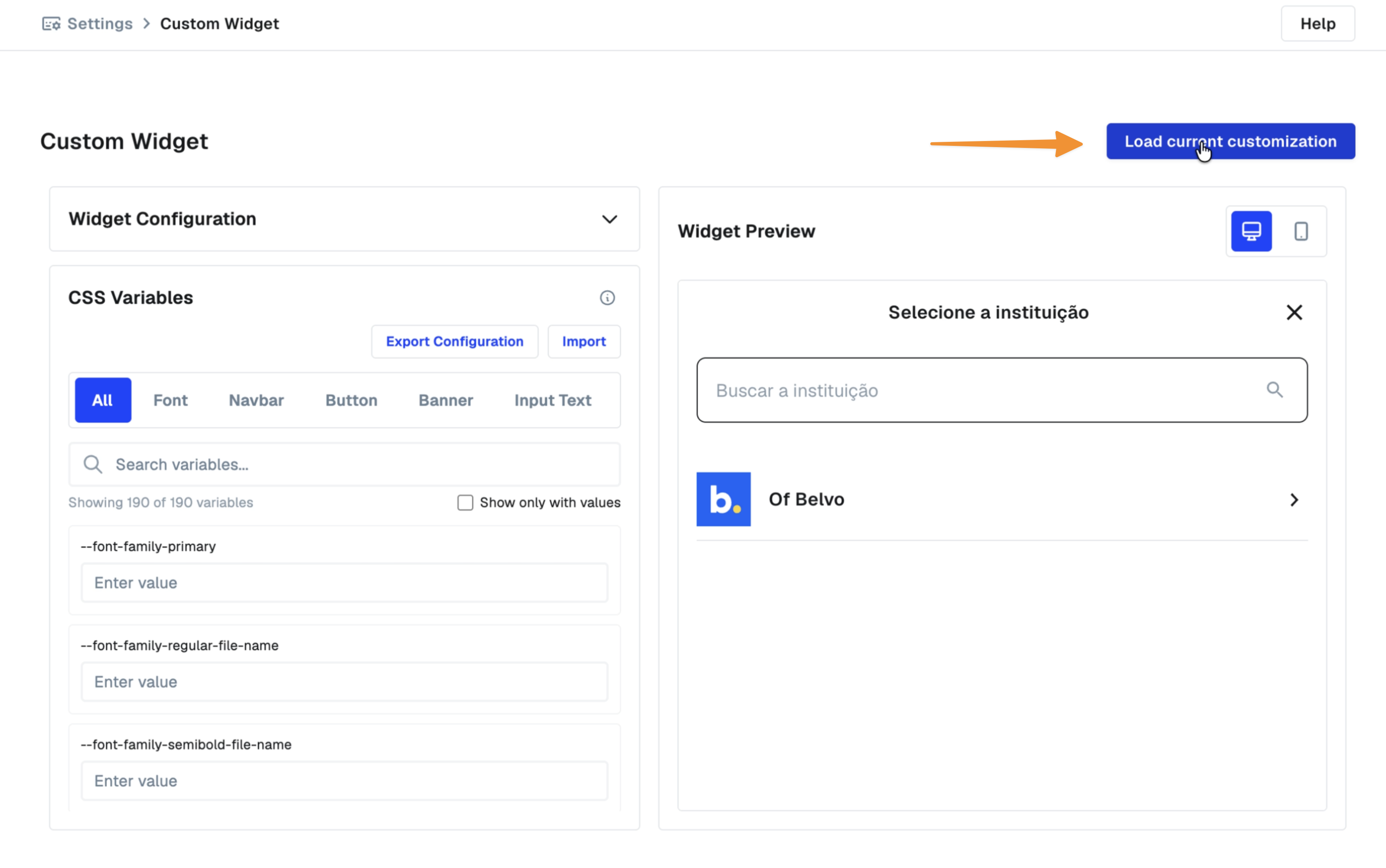
If your organization already has a saved customization, click Load current customization in the top-right corner of the page to load it directly into the editor and Widget Preview, instead of starting from scratch. If your organization has more than one saved customization, you'll be prompted to pick which one to load.
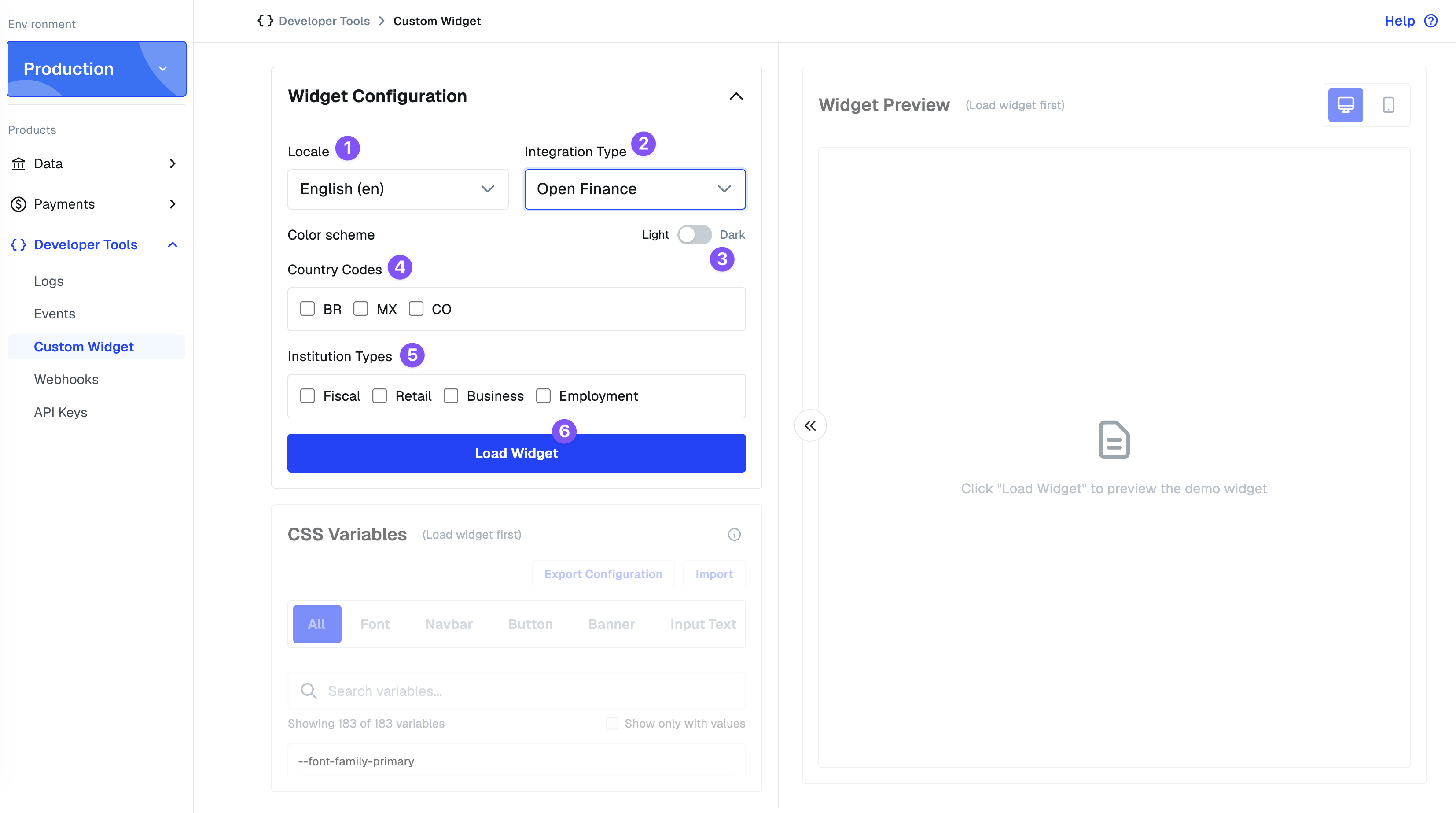
To configure a new customization instead, in the Widget Configuration section set the:
- Locale: the widget's display language:
en(English),es(Spanish), orpt-BR(Portuguese). - Integration Type:
Open Financefor the Brazil Open Finance (OFDA) widget, orCredentialsfor the multi-region widget. - Color scheme: Light or Dark. Dark-mode-specific CSS variables use a
-darksuffix, for example,--color-primary-base-darksets the primary color specifically for dark mode. - Country Codes: which countries' institutions appear in the widget preview.
- Institution Types: which kinds of institutions appear in the preview:
Fiscal(tax authority connections),Retail(personal banking),Business(corporate banking), orEmployment(employer/payroll systems).
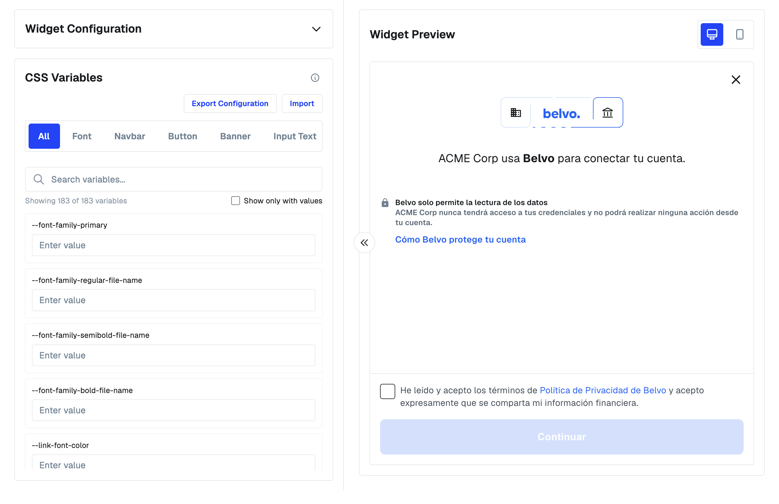
Once you've clicked Load Widget, or loaded an existing customization, you'll be able to access the CSS Variables panel. Search or use the category filters (Font, Navbar, Button, Banner, Input Text, and more) to find a variable, then enter a value. The Widget Preview on the right updates live as you type, so you can check each change before finalizing it.
Click Export Configuration. This automatically creates a Zendesk support ticket with your customization JSON attached, which the Belvo team uses to apply it to your account. Use Import to load a previously-exported configuration back into the tool if you want to keep editing it.
This page lists the available css_key parameters, their default values, and what each one controls. For any variable with a -dark counterpart, the -dark key sets that override specifically for dark mode. See the section above for how to apply these.
| CSS Variable | Default | Description |
|---|---|---|
--color-primary-base | #0663f9 | Sets the primary color for buttons, checkboxes, and the progress bar. |
--color-primary-base-dark | #0663f9 | Sets the primary color in dark mode. |
| CSS Variable | Default | Description |
|---|---|---|
--font-family-primary | Geist | Sets the primary font family used across the widget. Fallback font when no custom font is provided. |
--font-family-regular-file-name | — | Font file to use for regular (400) weight text. No default — only used if a custom font is provided. |
--font-family-semibold-file-name | — | Font file to use for semibold (600) weight text. No default — only used if a custom font is provided. |
--font-family-bold-file-name | — | Font file to use for bold (700) weight text. No default — only used if a custom font is provided. |
| CSS Variable | Default | Description |
|---|---|---|
--link-font-color | #0663f9 | Sets the font color for hyperlinks (for example, the privacy policy link). |
--link-font-color-dark | #0663f9 | Sets the font color for hyperlinks in dark mode. |
--link-text-decoration | none | Sets the text decoration (for example, underline) for hyperlinks. |
| CSS Variable | Default | Description |
|---|---|---|
--text-title-color | #161a1d | Sets the color of page-level titles. |
--text-title-color-dark | #eef3f8 | Sets the color of page-level titles in dark mode. |
--text-title-font-size | 1.125rem | Sets the font size of page-level titles. |
--text-title-line-height | 1.75rem (26px) | Sets the line height of page-level titles. |
--text-body-color | #414d58 | Sets the color of page-level body text. |
--text-body-color-dark | #c2cfd9 | Sets the color of page-level body text in dark mode. |
--text-body-font-size | 1rem | Sets the font size of page-level body text. |
--text-body-line-height | 1.5rem (24px) | Sets the line height of page-level body text. |
| CSS Variable | Default | Description |
|---|---|---|
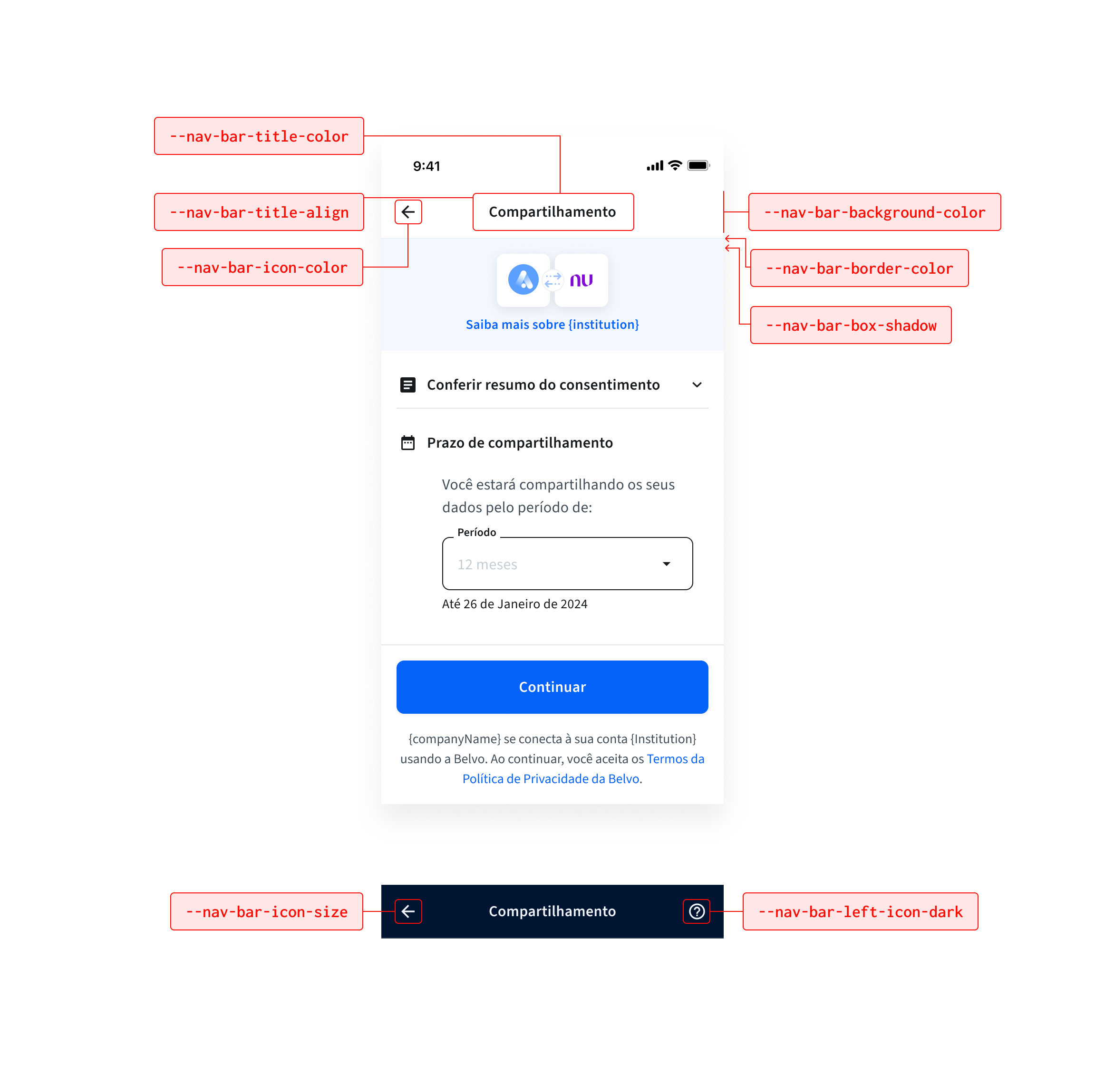
--nav-bar-title-color | #161a1d | Sets the color of the navigation bar title. |
--nav-bar-title-color-dark | #eef3f8 | Sets the color of the navigation bar title in dark mode. |
--nav-bar-title-align | center | Specifies the alignment of the navigation bar title. Possible positions are center, start, and end. |
--nav-bar-icon-color | #161a1d | Sets the color of navigation bar icons. |
--nav-bar-icon-color-dark | #eef3f8 | Sets the color of navigation bar icons in dark mode. |
--nav-bar-background-color | #ffffff | Defines the background color of the navigation bar. |
--nav-bar-background-color-dark | #011432 | Defines the background color of the navigation bar in dark mode. |
--nav-bar-left-icon | arrow_back | Sets a custom icon for the navigation bar's left action (for example, back arrow). |
--nav-bar-left-icon-dark | arrow_back | Sets a custom icon for the left action in dark mode. |
--nav-bar-right-icon | — | Sets a custom icon for the navigation bar's right action (for example, help). No default — set via a component prop, not the theme. |
--nav-bar-right-icon-dark | — | Sets a custom icon for the right action in dark mode. No default — set via a component prop, not the theme. |
--nav-bar-icon-size | 24px | Sets the icon size for navigation bar icons. |
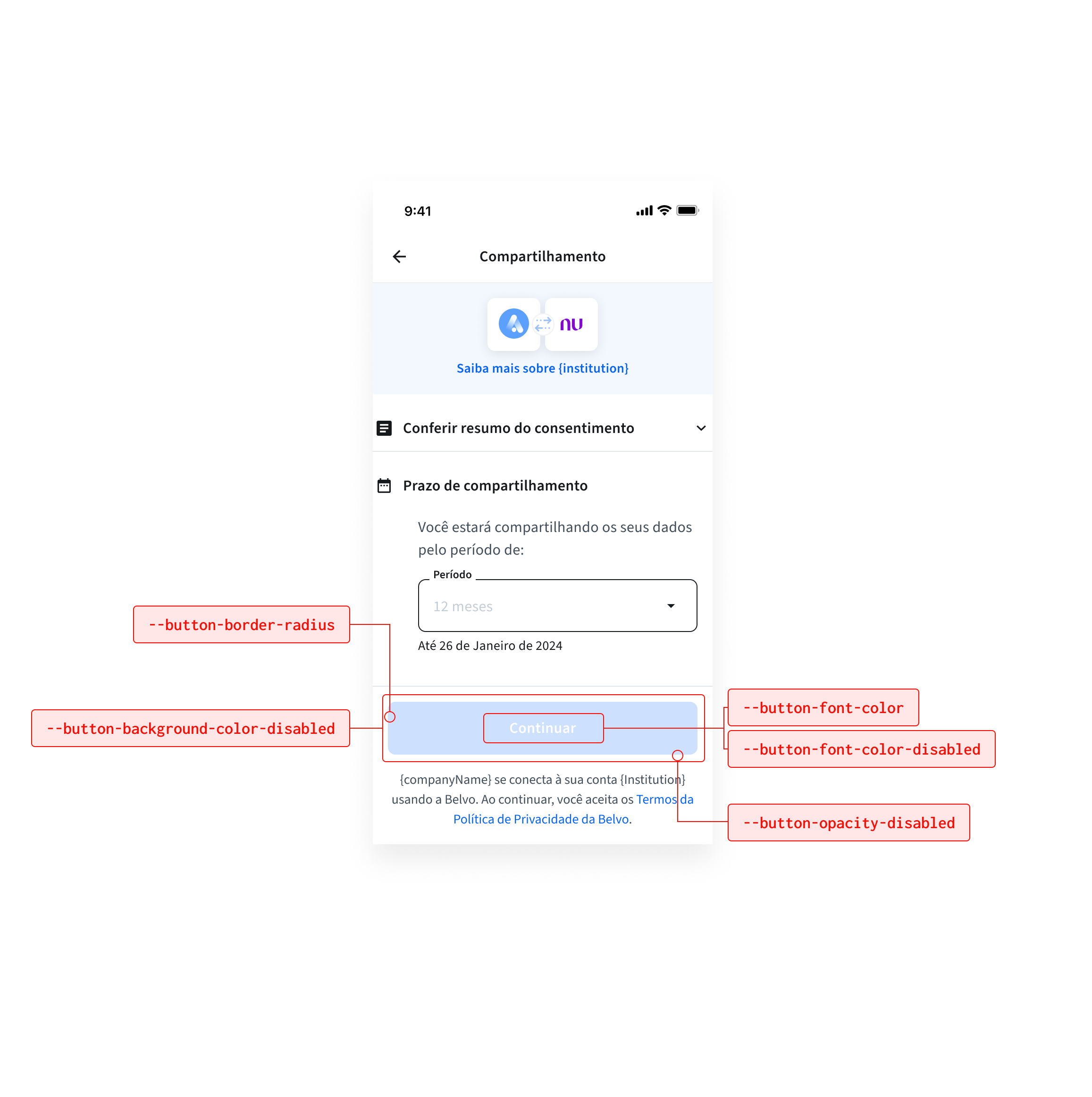
| CSS Variable | Default | Description |
|---|---|---|
--text-button-font-color | — | Sets the font color for text-only (non-filled) buttons. |
--text-button-font-color-dark | — | Sets the font color for text-only (non-filled) buttons in dark mode. |
--button-font-color | #ffffff | Sets the font color for buttons. |
--button-font-color-dark | — | Sets the font color for buttons in dark mode. |
--button-font-color-disabled | #ffffff | Defines the font color for disabled buttons. |
--button-font-color-disabled-dark | — | Defines the font color for disabled buttons in dark mode. |
--button-border-radius | 8px | Specifies the border radius of buttons. |
--button-background-color-disabled | #009EE3 | Defines the background color for disabled buttons. |
--button-background-color-disabled-dark | — | Defines the background color for disabled buttons in dark mode. |
--button-opacity-disabled | 0.2 | Specifies the opacity for disabled buttons. |
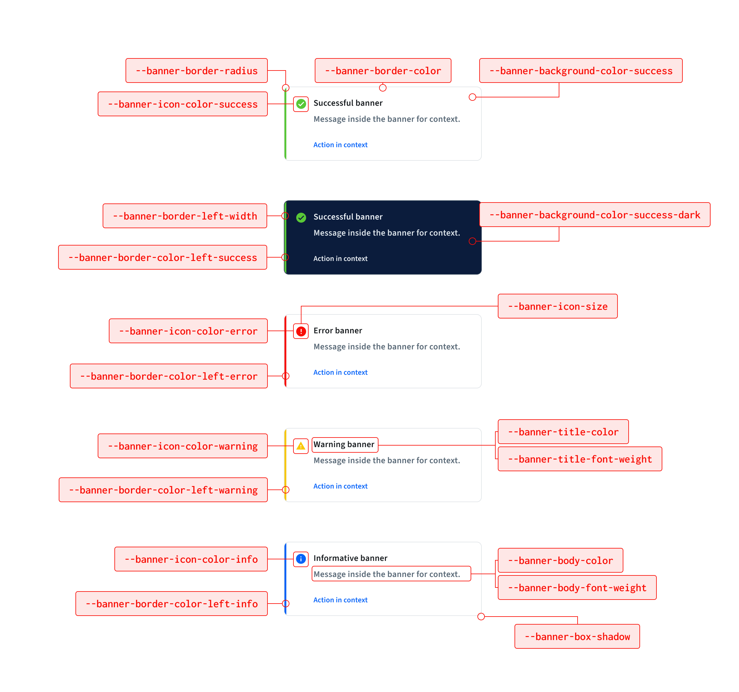
| CSS Variable | Default | Description |
|---|---|---|
--banner-border-radius | 8px | Specifies the border radius of banners. |
--banner-background-color | #ffffff | Sets the background color of banners. |
--banner-background-color-dark | #011432 | Sets the background color of banners in dark mode. |
--banner-background-color-error | #ffffff | Sets the background color for error banners. |
--banner-background-color-error-dark | #011432 | Sets the background color for error banners in dark mode. |
--banner-background-color-info | #ffffff | Sets the background color for info banners. (not in original 183-item list — added since it's already shipped) |
--banner-background-color-info-dark | #011432 | Sets the background color for info banners in dark mode. (not in original 183-item list — added since it's already shipped) |
--banner-background-color-success | #ffffff | Sets the background color for success banners. (not in original 183-item list — added since it's already shipped) |
--banner-background-color-success-dark | #011432 | Sets the background color for success banners in dark mode. (not in original 183-item list — added since it's already shipped) |
--banner-background-color-warning | #ffffff | Sets the background color for warning banners. (not in original 183-item list — added since it's already shipped) |
--banner-background-color-warning-dark | #011432 | Sets the background color for warning banners in dark mode. (not in original 183-item list — added since it's already shipped) |
--banner-border-color | #e2e6e9 | Specifies the border color of banners. |
--banner-border-color-dark | #2b3d54 | Specifies the border color of banners in dark mode. |
--banner-border-color-left-error | #f90e06 | Left border color for error banners. |
--banner-border-color-left-error-dark | #e04a39 | Left border color for error banners in dark mode. |
--banner-border-color-left-success | #59c837 | Left border color for success banners. |
--banner-border-color-left-success-dark | #59c837 | Left border color for success banners in dark mode. |
--banner-border-color-left-info | #0663f9 | Left border color for info banners. |
--banner-border-color-left-info-dark | #0663f9 | Left border color for info banners in dark mode. |
--banner-border-color-left-warning | #f9c806 | Left border color for warning banners. |
--banner-border-color-left-warning-dark | #f9c806 | Left border color for warning banners in dark mode. |
--banner-border-left-width | 0.25rem | Controls the left border thickness for banner variants. Set to 0 to remove the left border and rely only on background color. |
--banner-icon-color-error | #f90e06 | Icon color for error banners. |
--banner-icon-color-error-dark | #e04a39 | Icon color for error banners in dark mode. |
--banner-icon-color-success | #59c837 | Icon color for success banners. |
--banner-icon-color-success-dark | #59c837 | Icon color for success banners in dark mode. |
--banner-icon-color-info | #0663f9 | Icon color for info banners. |
--banner-icon-color-info-dark | #0663f9 | Icon color for info banners in dark mode. |
--banner-icon-color-warning | #f9c806 | Icon color for warning banners. |
--banner-icon-color-warning-dark | #f9c806 | Icon color for warning banners in dark mode. |
--banner-icon-size | 24px | Sets the icon size for banner icons. |
--banner-icon-name-error | — | Sets the icon used for error banners. No default — no icon shown unless provided. |
--banner-icon-name-success | — | Sets the icon used for success banners. No default — no icon shown unless provided. |
--banner-icon-name-info | — | Sets the icon used for info banners. No default — no icon shown unless provided. |
--banner-icon-name-warning | — | Sets the icon used for warning banners. No default — no icon shown unless provided. |
--banner-title-color | #161a1d | Sets the color of banner titles. |
--banner-title-color-dark | #eef3f8 | Sets the color of banner titles in dark mode. |
--banner-body-color | #576775 | Specifies the color of banner body text. |
--banner-body-color-dark | #a6b4c3 | Specifies the color of banner body text in dark mode. |
--banner-title-font-weight | 600 | Defines the font weight of banner titles. |
--banner-body-font-weight | 600 | Specifies the font weight of banner body text. |
--banner-box-shadow | 0 2px 4px 0 rgb(0 0 0 / 5%) | Adds a shadow effect to banners. |
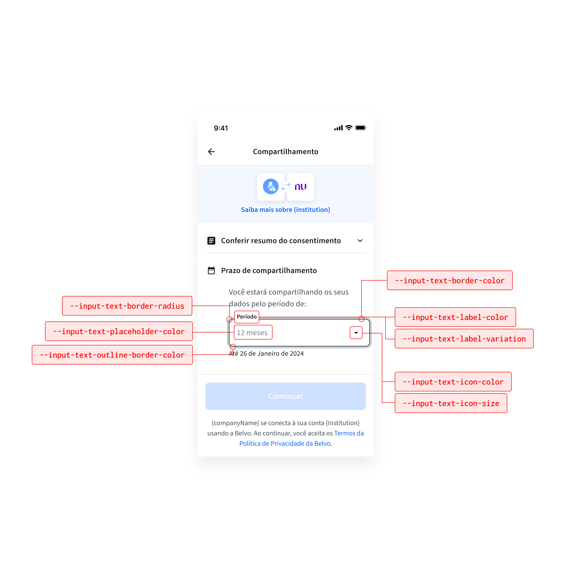
| CSS Variable | Default | Description |
|---|---|---|
--input-text-font-size | 1rem | Sets the font size for input field text. |
--input-text-font-color | #161a1d | Sets the font color for input field text. |
--input-text-font-color-dark | #eef3f8 | Sets the font color for input field text in dark mode. |
--input-text-border-radius | 8px | Defines the border radius for input fields. |
--input-text-border-color | #161a1d | Specifies the border color for input fields. |
--input-text-border-color-dark | #2b3d54 | Specifies the border color for input fields in dark mode. |
--input-text-outline-border-color | #0663f980 | Defines the outline border color for input fields (like a hover effect). |
--input-text-outline-border-color-dark | #0663f980 | Defines the outline border color for input fields in dark mode. |
--input-text-border-color-error | #f90e06 | Sets the border color for input fields in an error state. |
--input-text-border-color-error-dark | #e04a39 | Sets the border color for input fields in an error state, in dark mode. |
--input-text-placeholder-color | #8a9aa8 | Defines the color for placeholder text. |
--input-text-placeholder-color-dark | #2b3d54 | Defines the color for placeholder text in dark mode. |
--input-text-label-color | #414d58 | Sets the label color for input fields. |
--input-text-label-color-dark | #eef3f8 | Sets the label color for input fields in dark mode. |
--input-text-label-color-error | #f90e06 | Specifies the label color for input fields in error state. |
--input-text-label-color-error-dark | #e04a39 | Specifies the label color for input fields in error state, in dark mode. |
--input-text-label-variation | top | Specifies the label variation. Possible options are top (label above the field) and placeholder (uses the label as the input placeholder). |
--input-text-label-weight | 600 | Sets the font weight for input field labels. |
--input-text-label-font-size | 0.75rem | Sets the font size for input field labels. |
--input-text-assistive-color | #2b343b | Sets the color for assistive (helper) text below an input field. |
--input-text-assistive-color-dark | #eef3f8 | Sets the color for assistive text in dark mode. |
--input-text-assistive-color-error | #f90e06 | Sets the color for assistive text when the input field is in an error state. |
--input-text-assistive-color-error-dark | #e04a39 | Sets the color for assistive text in an error state, in dark mode. |
--input-text-assistive-font-weight | 400 | Sets the font weight for assistive text. |
--input-text-icon-color | #8a9aa8 | Sets the color of input icons. |
--input-text-icon-color-dark | #eef3f8 | Sets the color of input icons in dark mode. |
--input-text-icon-opacity | — | Sets the opacity for input field icons. No default — not currently consumed in CSS. |
--input-text-icon-size | 40px | Sets the size for input field icons. |
--input-text-icon-order | 1 | Sets the display order of icons within an input field. |
--input-text-password-visible-icon | show | Sets the icon shown when a password field's contents are visible. |
--input-text-password-non-visible-icon | hide | Sets the icon shown when a password field's contents are hidden. |
| CSS Variable | Default | Description |
|---|---|---|
--checkbox-border-color | #161a1d | Sets the border color for checkboxes. |
--checkbox-border-color-dark | #2b3d54 | Sets the border color for checkboxes in dark mode. |
--checkbox-border-radius | 4px | Sets the border radius for checkboxes. |
| CSS Variable | Default | Description |
|---|---|---|
--dialog-title-color | #161a1d | Sets the color of dialog titles. |
--dialog-title-color-dark | #eef3f8 | Sets the color of dialog titles in dark mode. |
--dialog-body-color | #8a9aa8 | Sets the color of dialog body text. |
--dialog-body-color-dark | #6a7e93 | Sets the color of dialog body text in dark mode. |
--dialog-body-font-size | 1rem | Sets the font size of dialog body text. |
--dialog-body-line-height | 24px | Sets the line height of dialog body text. |
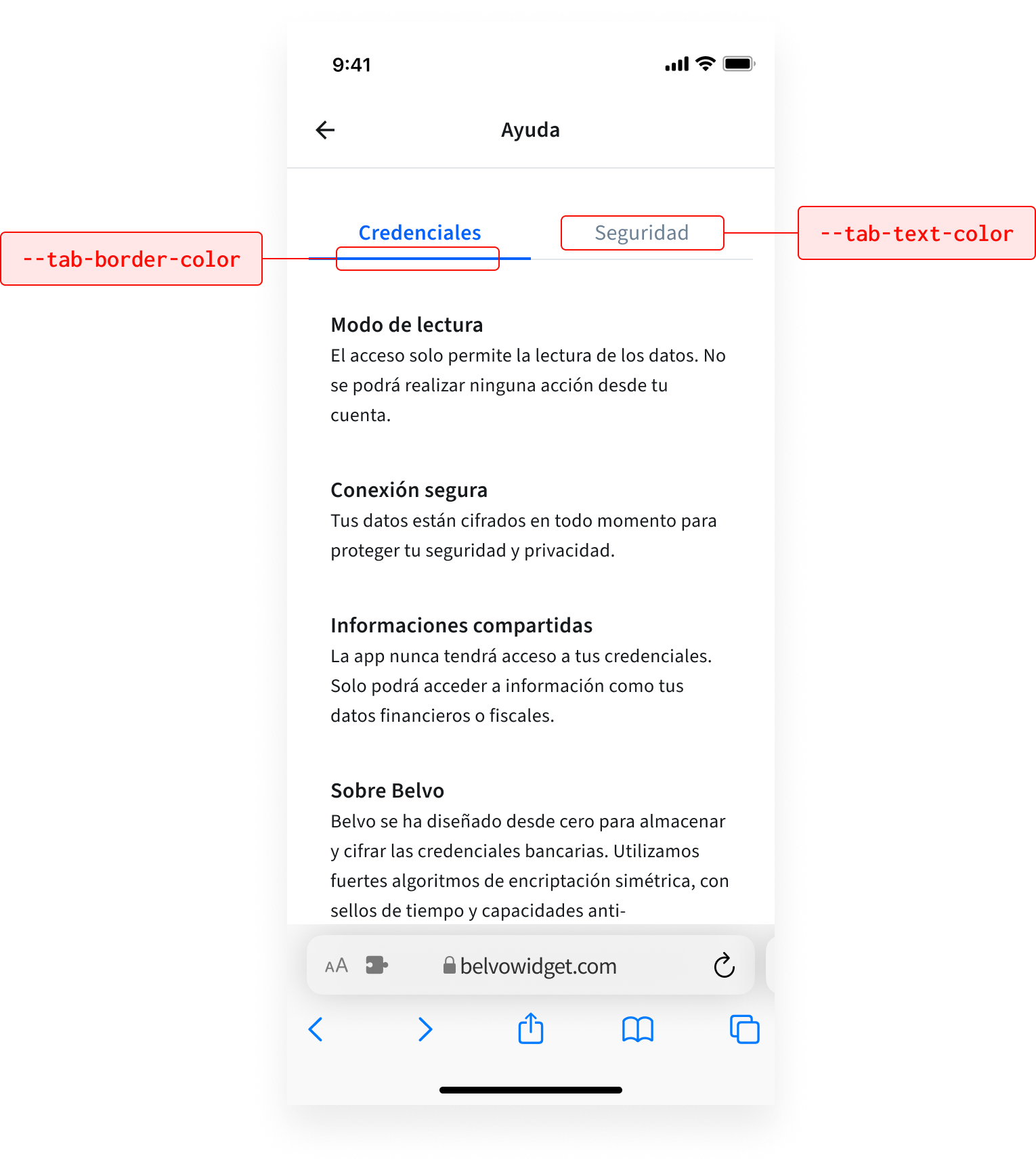
| CSS Variable | Default | Description |
|---|---|---|
--tab-text-color | #0663f9 | Defines the text color for the tabs. |
--tab-text-color-dark | #0663f9 | Sets the text color for tabs in dark mode. |
--tab-border-color | #0663f9 | Specifies the border color for the bottom of the tabs. |
--tab-border-color-dark | #0663f9 | Sets the border color for the bottom of tabs in dark mode. |
| CSS Variable | Default | Description |
|---|---|---|
--dropdown-border-radius | 8px | Sets the border radius for dropdown fields. |
--dropdown-font-color | #161a1d | Sets the font color for dropdown fields. |
--dropdown-font-color-dark | #eef3f8 | Sets the font color for dropdown fields in dark mode. |
--dropdown-label-display | visible | Controls how the dropdown label is displayed. |
| CSS Variable | Default | Description |
|---|---|---|
--item-list-hover-color | #f0f2f4 | Sets the background color of a list item on hover. |
--item-list-hover-color-dark | #0b1c3c | Sets the background color of a list item on hover, in dark mode. |
--item-list-skeleton-color | #f0f2f4 | Sets the color of the loading skeleton shown while a list is loading. |
--item-list-skeleton-color-dark | #0b1c3c | Sets the color of the loading skeleton in dark mode. |
--item-list-icon-color | #161a1d | Sets the color of icons within a list item. |
--item-list-icon-color-dark | #eef3f8 | Sets the color of icons within a list item in dark mode. |
--item-list-title-color | #161a1d | Sets the color of a list item's title. |
--item-list-title-color-dark | #eef3f8 | Sets the color of a list item's title in dark mode. |
--item-list-body-color | #6c8193 | Sets the color of a list item's body/secondary text. |
--item-list-body-color-dark | #dee6ec | Sets the color of a list item's body/secondary text in dark mode. |
| CSS Variable | Default | Description |
|---|---|---|
--accordion-icon-color | #161a1d | Sets the color of the accordion expand/collapse icon. |
--accordion-icon-color-dark | #eef3f8 | Sets the color of the accordion expand/collapse icon in dark mode. |
--accordion-title-color | #161a1d | Sets the color of the accordion title. |
--accordion-title-color-dark | #eef3f8 | Sets the color of the accordion title in dark mode. |
You can add a custom overlay color for when the widget loads in your desktop application. We recommend choosing a neutral color related to your brand to keep environmental context.
No matter what color you choose, Belvo automatically sets the opacity to 90%. This is due to the following UX best practices:
- With lower opacities (less than 70%), users can experience difficulty focusing on the flow, since they'll have "visual noise" in the background.
- Block colors (opacity set at 100%) may cause a drastic change, resulting in a disjointed or unnatural experience.
| CSS Variable | Default | Description |
|---|---|---|
--overlay-background-color | #03286380 | Sets the background color of the overlay shown behind the widget. Defaults to grey. |
--overlay-background-color-dark | #03286380 | Sets the background color of the overlay in dark mode. |
--surface-color | #ffffff | Sets the base surface (background) color of the widget. |
--surface-color-dark | #011432 | Sets the base surface (background) color of the widget in dark mode. |
--divider-color | #e2e6e9 | Sets the color of divider lines. |
--divider-color-dark | #2b3d54 | Sets the color of divider lines in dark mode. |
--image-border-radius | 8px | Sets the border radius for images displayed within the widget. |
--layout-side-padding | 16px | Sets the horizontal side padding for the widget layout. |
| CSS Variable | Default | Description |
|---|---|---|
--consent-details-identification-section-icon | article | Sets the icon for the identification section on the consent details screen. |
--consent-details-expiration-section-icon | date_range | Sets the icon for the expiration section on the consent details screen. |
--consent-details-header-background-color | color-mix(in srgb, #0663f9, white 90%) (≈ pale blue) | Sets the background color of the consent details screen header. |
--consent-details-header-background-color-dark | color-mix(in srgb, #0663f9, #011432 80%) (≈ dark navy) | Sets the background color of the consent details screen header in dark mode. |
| CSS Variable | Default | Description |
|---|---|---|
--consent-summary-identification-section-icon | profile_filled | Sets the icon for the identification section on the consent summary screen. |
--consent-summary-expiration-section-icon | date_range | Sets the icon for the expiration section on the consent summary screen. |
--consent-summary-purpose-section-icon | badge_check | Sets the icon for the purpose section on the consent summary screen. |
--consent-summary-shared-information-section-icon | info | Sets the icon for the shared-information section on the consent summary screen. |
The loading screen shown while consent is being processed.
| CSS Variable | Default | Description |
|---|---|---|
--fetching-consent-title-font-size | 1.125rem | Sets the title font size on the fetching-consent screen. |
--fetching-consent-title-line-height | 1.75rem | Sets the title line height on the fetching-consent screen. |
--fetching-consent-body-font-size | 0.875rem | Sets the body text font size on the fetching-consent screen. |
--fetching-consent-body-line-height | 22px | Sets the body text line height on the fetching-consent screen. |
| CSS Variable | Default | Description |
|---|---|---|
--redirect-title-font-size | — | Sets the title font size on the redirect screen. No runtime default — no component consumer found in the codebase; effectively unused/legacy. |
--redirect-title-line-height | — | Sets the title line height on the redirect screen. No runtime default — no component consumer found in the codebase; effectively unused/legacy. |
--redirect-body-font-size | — | Sets the body text font size on the redirect screen. No runtime default — no component consumer found in the codebase; effectively unused/legacy. |
--redirect-body-line-height | — | Sets the body text line height on the redirect screen. No runtime default — no component consumer found in the codebase; effectively unused/legacy. |
--redirect-openfinance-logo-visibility | — | Controls whether the Open Finance logo is visible on the redirect screen. No runtime default — no component consumer found in the codebase; effectively unused/legacy. |