The content of this article refers to the multi-region widget (applicable for Employments and Fiscal in Mexico as well as Employments in Brazil). If you wish to operate in Brazil, please see our Hosted Widget for Regulated OFDA.
With Belvo's Connect Widget, you can optionally add the following branding and customization:
- Your company logo
- Your company icon
- Your company name
- Link to your privacy policy
- Text to highlight the benefits of your product
- Text when a user chooses to close the widget
- Hide messaging in the account connect screen
- Add a custom overlay color
- Enable dark mode
- Add custom colors to the widget
To add branding to your widget, it must be done in the same backend call as your request to generate an access_token.
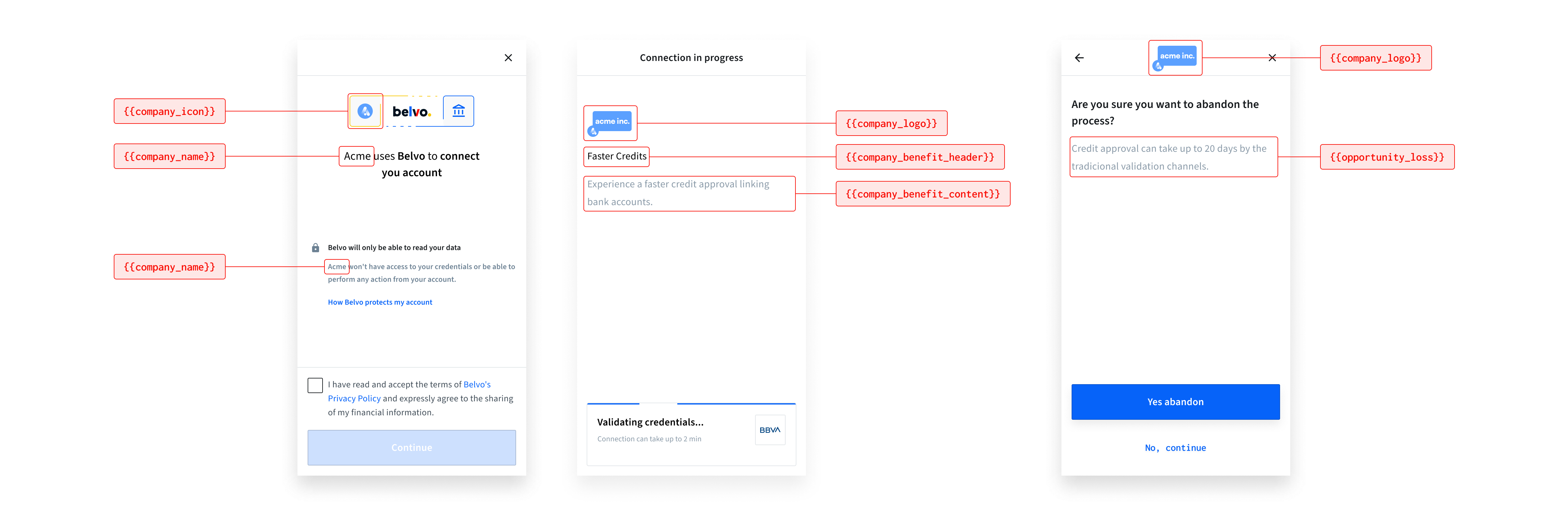
You can add your company icon to the widget to make it more aligned with your brand.
When you add your company icon, it appears on the following screens:
- initial start of the widget
Make sure that your icon has square dimensions, in SVG format, has a transparent background, and contains no surrounding whitespace. If your icon does not follow these specifications, the Belvo widget will display the following icon:
Instructions
To add a custom company icon, just add the URL to your SVG image to the company_icon key.
{
  "widget": {
    "branding": {
      "company_icon": "https://mysite.com/icon.svg",
        }
     }
}You can add your company logo to the widget to make it more aligned with your brand. When you add your company logo, it appears on the following screens:
- while the account is being linked
- once an account is successfully linked
- when a user chooses to cancel the linking process
Make sure that your logo is in SVG format, has a transparent background, and contains no surrounding whitespace. For the best visibility and scaling, we suggest that you use a horizontal logo (see the top-left example in the image below).
Instructions
To add a custom company logo, just add the URL to your SVG image to the company_logo key.
{
  "widget": {
    "branding": {
      "company_logo": "https://mysite.com/logo.svg",
        }
     }
}You can add your company name to be displayed when the widget first starts. By default, it'll just display "Link your account". When you add your company name, the message will follow the format "[company_name] uses Belvo to connect your account".
Please note, only the company name is customizable in the introductory sentence
Instructions
To add your company name, just add it to the company_name key.
{
  "widget": {
    "branding": {
      "company_name": "ACME",
        }
     }
}You can add a link to your privacy policy (or terms and conditions) on the initial screen of the widget that, when clicked, will redirect your users to the linked webpage. This helps your users better understand what your use case is regarding the data you are requesting. By default the widget will include the URL to Belvo's privacy policy (<https://belvo.com/terms-service/>).
Instructions
To add a link to your privacy policy in the initial connect screen, just add the URL to your policy to the company_terms_url key.
{
  "widget": {
    "branding": {
      "company_terms_url": "https://belvo.com/terms-service/",
        }
     }
}When using a custom terms and conditions URL (via company_terms_url), you can track which version of your T&C the user accepted during the widget flow. This is useful for compliance and audit purposes, especially when your terms are updated over time.
Instructions
To track the T&C version, add the version identifier to the company_terms_version key. This parameter is required when you provide a custom company_terms_url (not using Belvo's default).
We recommend using a date format (e.g., 2024-03-15 or 20240315) to clearly indicate when your terms were last updated. This makes it easier to track changes over time compared to version numbers.
{
  "widget": {
    "branding": {
      "company_terms_url": "https://yourcompany.com/terms",
      "company_terms_version": "2024-03-15",
        }
     }
}You can add a custom message on the initial screen of the widget to provide additional information to your users about why they need to connect their account using Belvo. This helps to drive conversion and increase end-user trust to link their account.
Instructions
To add custom text in the initial connect screen:
Add the title of the expand box to the
company_benefit_headerkey.
📝 The maximum length (including spaces) for the title is 30 characters.Add the content for the expand box to the
company_benefit_contentkey.
📝 The maximum length (including spaces) for the content is 140 characters.
You must provide content for both company_benefit_header and company_benefit_content. If you don't provide content for both, nothing will appear
{
  "widget": {
    "branding": {
      "company_benefit_header": "Faster approvals",
      "company_benefit_content": "Using Belvo cuts down on your loan approval time by up to 15 days.",
        }
     }
}You can add a custom message to be displayed when an end user chooses to cancel connecting their account. The message appears below a standard "Are you sure you want to cancel?" prompt. You can highlight the benefits of continuing to link their account using the widget in comparison to traditional methods.
Instructions
To add a custom exit message, add the content to display to the opportunity_loss key.
📝 Your message can have a maximum of 120 characters, including spaces.
{
  "widget": {
    "branding": {
      ...
      "opportunity_loss": "It can take up to 20 days to evaluate your request using traditional methods.",
      ...
        }
     }
}You can choose to hide the "+1m users have securely connected their accounts using Belvo" message that appears when your user reaches the account connection screen in the widget. By default, this message is visible in the widget (true).
** Instructions**
To hide the message in the account connection screen, just set the social_proof parameter to false.
{
  "widget": {
    "branding": {
      "social_proof": false,
        }
     }
}You can add a custom overlay color for when the widget loads in your desktop application. We recommend choosing a neutral color related to your brand to keep environmental context. By default, this overlay is set to grey.

No matter what color you upload, Belvo will automatically set the opacity to 90%. This is due to the following UX best practices:
- With lower opacities (less than 70%), the user can experience difficulties focusing on the flow as they will have “visual noise" in the background.
- Block colors (opacity set at 100%) may cause a drastic change, resulting in a disjointed or unnatural experience.
Instructions
To set the overlay color, just add the full HEX code (## followed by six characters) to the overlay_background_color key.
{
"widget": {
"branding": {
"overlay_background_color": "#F0F2F4",
}
}
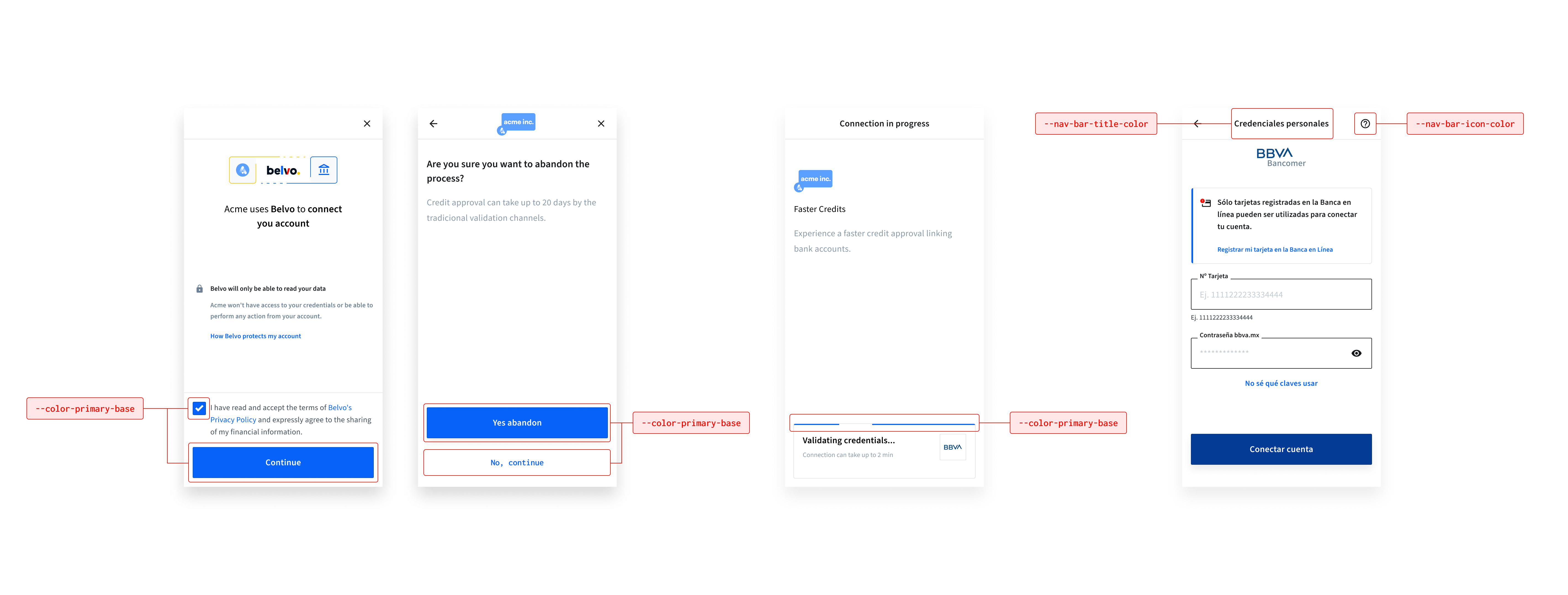
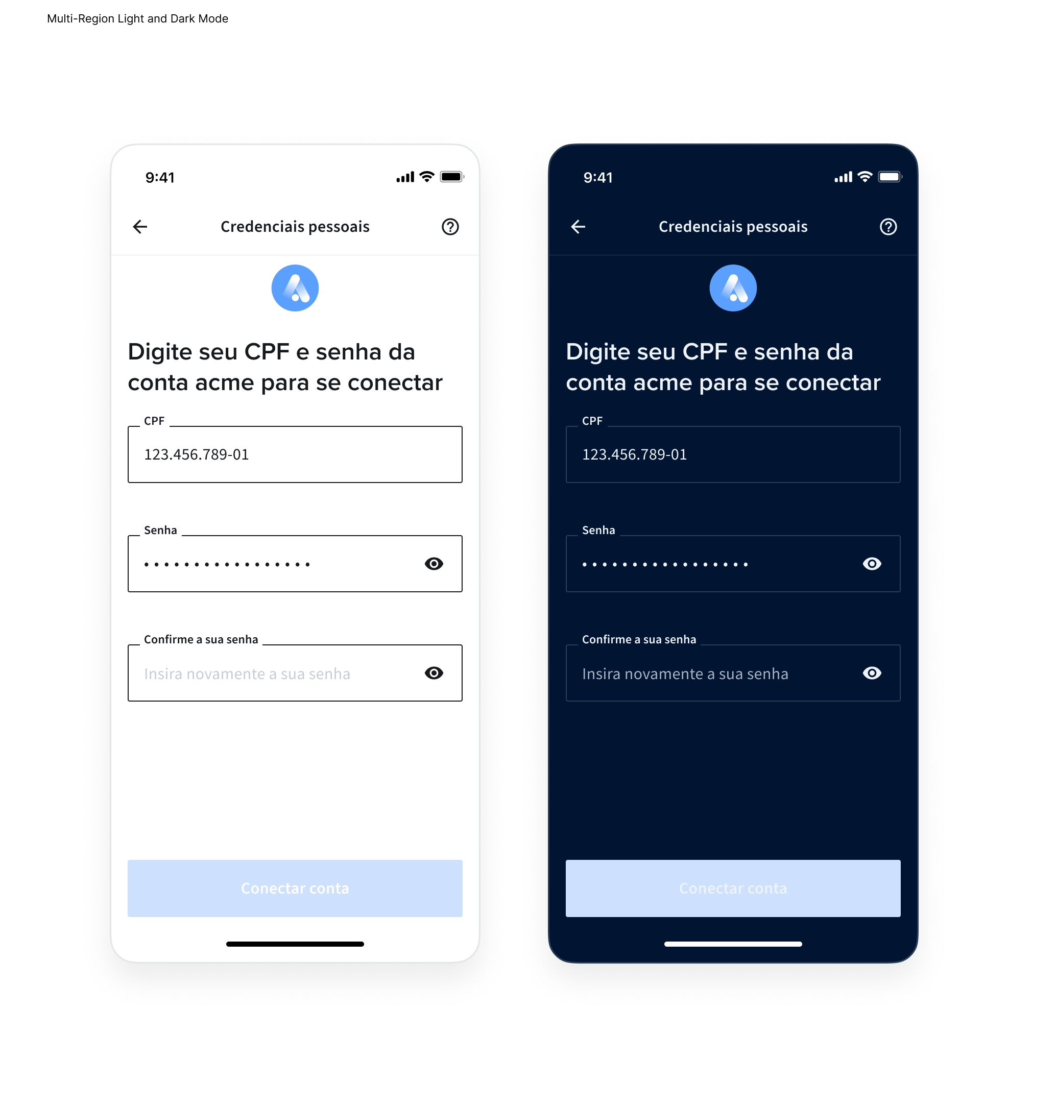
}The Connect Widget supports a dark mode theme. To enable it, you need to pass the DARK value in the color_scheme parameter inside the widget object.
{
  "widget": {
    "color_scheme": "DARK",
  }
}
When dark mode is enabled, you can also customize the colors. To apply a custom style specifically for dark mode, simply append -dark to any of the CSS variables listed in the sections below. For example, to change the primary color in dark mode, you would use "--color-primary-base-dark".
You can customize the widget by adding your own brand’s colors to several parts of the widget:
- The primary color for buttons, checkboxes, and the progress bar
- The color of the navigation icons and text
The possible modifications are listed in the table below:
| CSS Variable | Default (Light) | Default (Dark) | Description |
|---|---|---|---|
--color-primary-base | #0663F9 | #0663F9 | Sets the primary color for buttons, checkboxes, and the progress bar. |
--nav-bar-title-color | #161A1D | #011432 | Sets the color of the navigation bar title. |
--nav-bar-icon-color | #161A1D | #011432 | Sets the color of navigation bar icons. |
Instructions
To set your brand’s colors:
- Add the
themearray to thewidgetobject. - For each item you want to modify, add an object that has the keys
css_keyandvalue(see the code sample below). The color values can be either in HEX, RGB, or RGBA format.
{
  "widget": {
    "color_scheme": "LIGHT",
    "branding": {}, // Your customized branding
    "theme": [
      {
        "css_key": "--color-primary-base",
        "value": "#0663F9"
      },
      {
        "css_key": "--nav-bar-title-color",
        "value": "#161A1D"
      },
      {
        "css_key": "--nav-bar-icon-color",
        "value": "#161A1D"
      }
    ],
  }
}
You do not have to include all the possible css_keys. You can just set the keys (and values) that you want to modify
You can customize the widget's navigation bar by modifying the colors to suit your brand's needs:
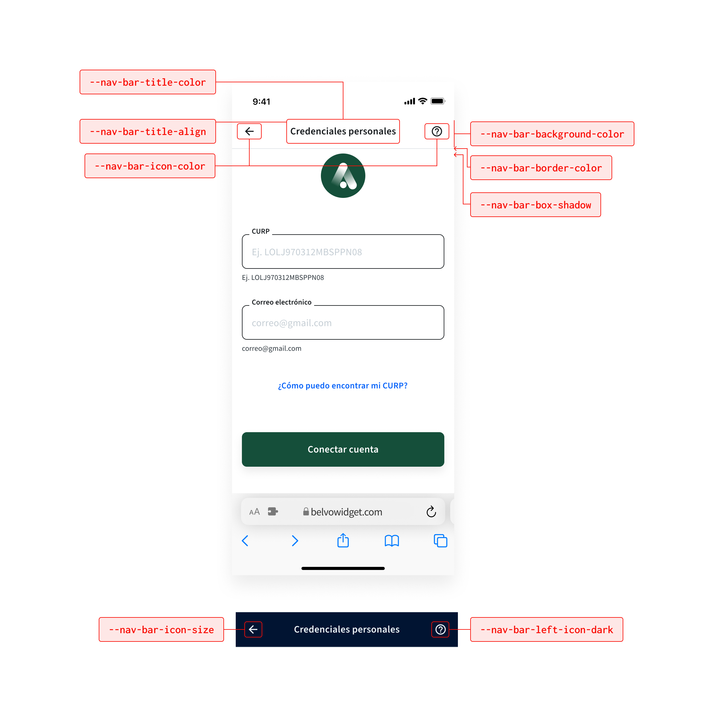
The possible modifications are listed in the table below:
| CSS Variable | Default (Light) | Default (Dark) | Description |
|---|---|---|---|
--nav-bar-title-color | #161a1d | #011432 | Sets the color of the navigation bar title. |
--nav-bar-title-align | center | center | Specifies the alignment of the navigation bar title. Possible positions are: center, start, and end. |
--nav-bar-icon-color | #161a1d | #011432 | Sets the color of navigation bar icons. |
--nav-bar-icon-size | 24px | 24px | Sets the icon size for navigation bar icons (for example, 40px). |
--nav-bar-background-color | #ffffff | #011432 | Defines the background color of the navigation bar. |
--nav-bar-box-shadow | none | none | Adds a shadow effect to the navigation bar. |
--nav-bar-border-color | #f0f2f4 | #2B3D54 | Specifies the border color of the navigation bar. |
Use --nav-bar-left-icon-dark and --nav-bar-right-icon-dark when you want different icon assets for dark mode. If you only need different icon colors per theme, use --nav-bar-icon-color-dark.
To modify the widget's navigation bar:
- Add the
themearray to thewidgetobject. - For each item you want to modify, add an object that has the keys
css_keyandvalue(see the code sample below). The color values can be either in HEX, RGB, or RGBA format.
{
  "widget": {
    "color_scheme": "LIGHT",
    "branding": {}, // Your customized branding
    "theme": [
      {
        "css_key": "--nav-bar-title-color",
        "value": "#161a1d"
      },
      {
        "css_key": "--nav-bar-title-align",
        "value": "center"
      },
      {
        "css_key": "--nav-bar-icon-color",
        "value": "#161a1d"
      },
      {
        "css_key": "--nav-bar-left-icon",
        "value": "arrow_left"
      },
      {
        "css_key": "--nav-bar-right-icon",
        "value": "help_outlined"
      },
      {
        "css_key": "--nav-bar-icon-size",
        "value": "24px"
      },
      {
        "css_key": "--nav-bar-background-color",
        "value": "#ffffff"
      },
      {
        "css_key": "--nav-bar-box-shadow",
        "value": "none"
      },
      {
        "css_key": "--nav-bar-border-color",
        "value": "#f0f2f4"
      }, // Add additional theming options here
    ]
  }
}You can customize the widget's buttons by modifying the colors and border radiuses to suit your brand's needs:
These modifications apply to all buttons in the widget
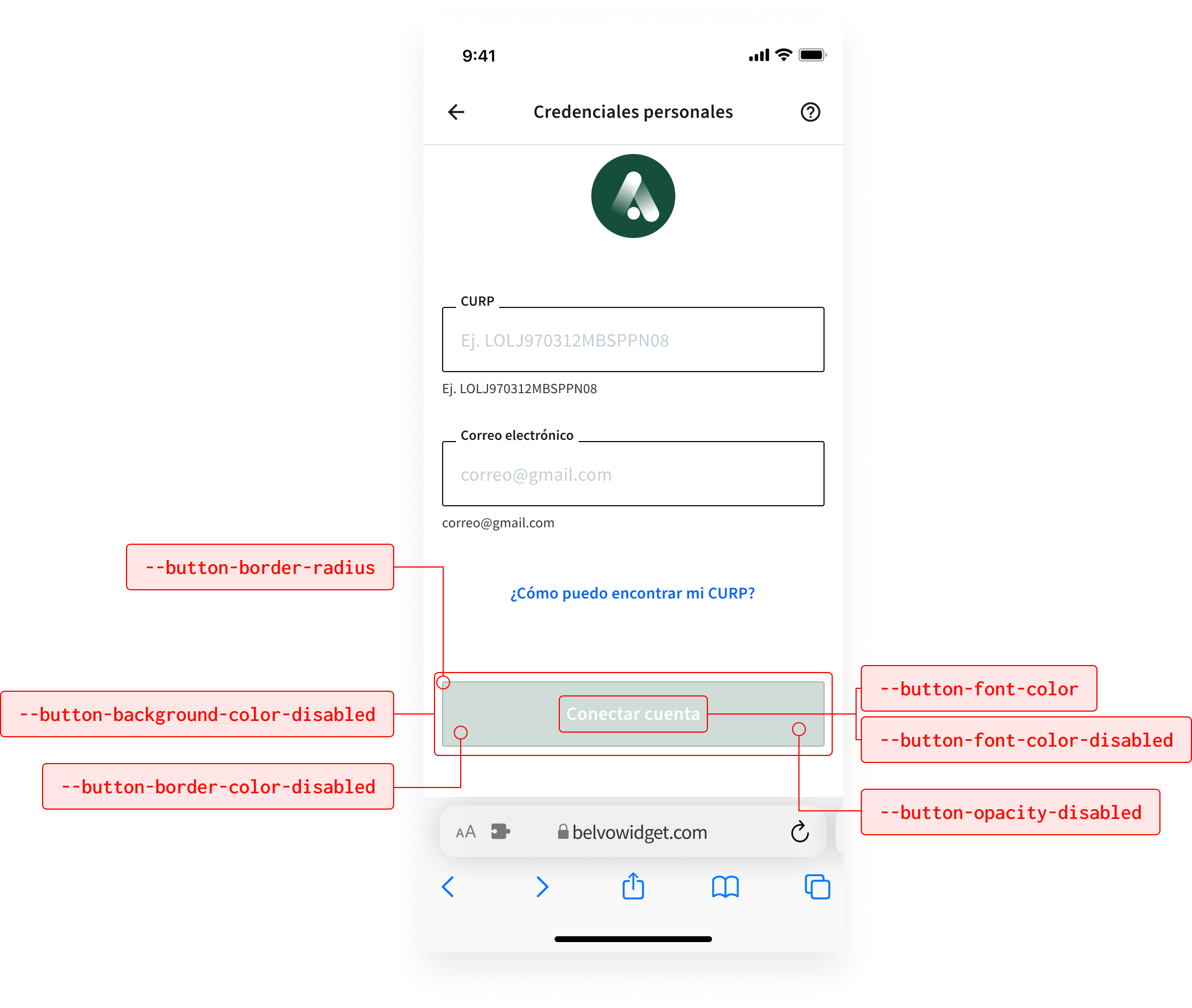
The possible modifications are listed in the table below:
| CSS Variable | Default (Light) | Default (Dark) | Description |
|---|---|---|---|
--button-font-color | #ffffff | #EEF3F8 | Sets the font color for buttons. |
--button-font-color-disabled | #ffffff | #EEF3F8 | Defines the font color for disabled buttons. |
--button-border-radius | 2px | 2px | Specifies the border radius of buttons. |
--button-background-color-disabled | #009EE3 | #0663F9 | Defines the background color for disabled buttons. |
--button-opacity-disabled | 0.2 | 0.2 | Specifies the opacity for disabled buttons. |
--button-border-color-disabled | #09EE354 | #09EE354 | Sets the border color for disabled buttons. |
To make modifications to the widget's buttons:
- Add the
themearray to thewidgetobject. - For each item you want to modify, add an object that has the keys
css_keyandvalue(see the code sample below). The color values can be either in HEX, RGB, or RGBA format.
{
  "widget": {
    "color_scheme": "LIGHT",
    "branding": {}, // Your customized branding
    "theme": [
      {
        "css_key": "--button-font-color",
        "value": "#ffffff"
      },
      {
        "css_key": "--button-font-color-disabled",
        "value": "#ffffff"
      },
      {
        "css_key": "--button-border-radius",
        "value": "2px"
      },
      {
        "css_key": "--button-background-color-disabled",
        "value": "#009EE3"
      },
      {
        "css_key": "--button-opacity-disabled",
        "value": "0.2"
      },
      {
        "css_key": "--button-border-color-disabled",
        "value": "#09EE354"
      }, // Add additional theming options here
    ]
  }
}You can customize the widget's banners to suit your brand's needs:
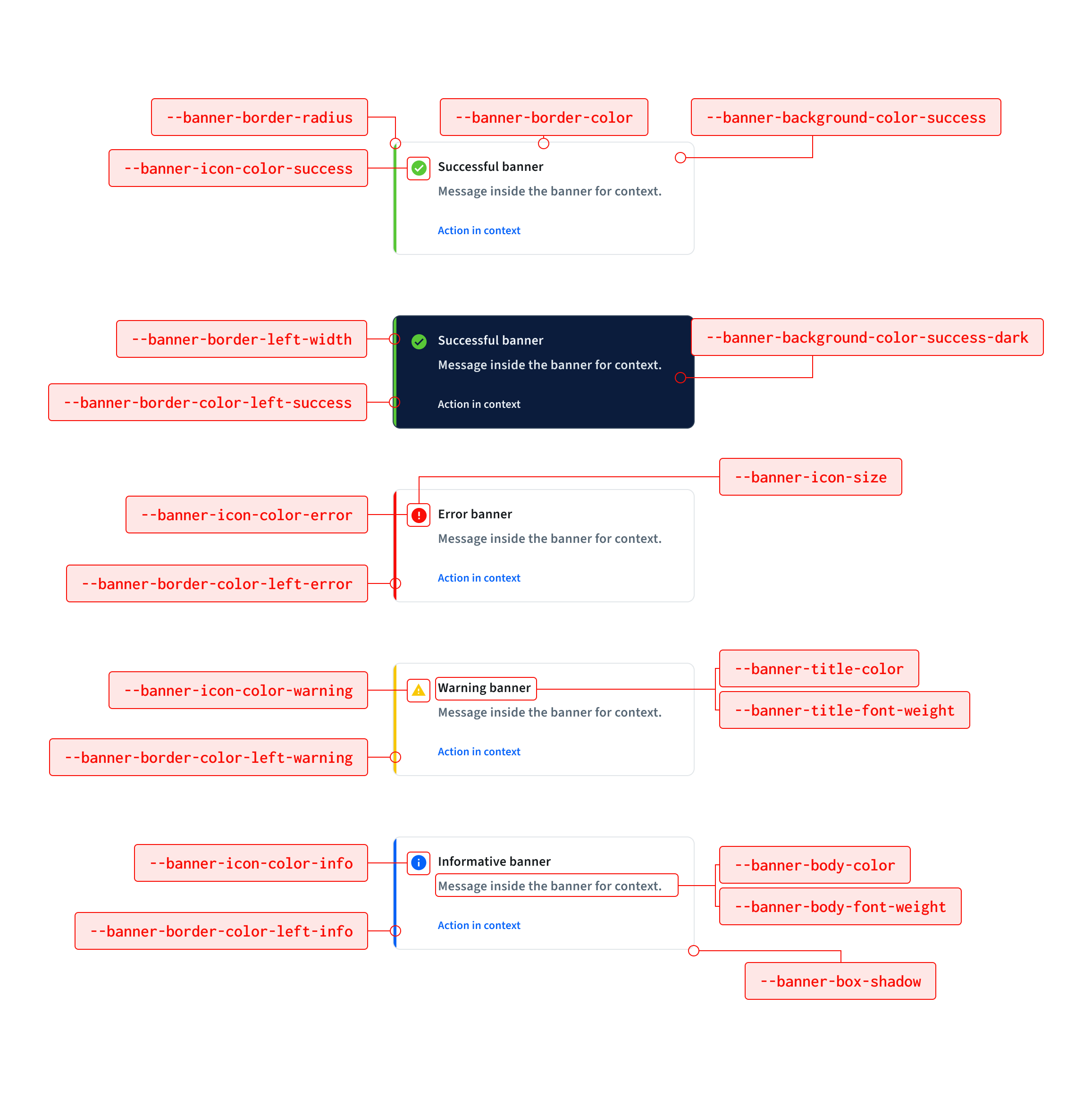
The possible modifications are listed in the table below:
| CSS Variable | Default (Light) | Default (Dark) | Description |
|---|---|---|---|
--banner-border-radius | 4px | 4px | Specifies the border radius of banners. |
--banner-background-color | #ffffff | #011432 | Sets the background color of banners. |
--banner-background-color-error | #FFFFFF | #011432 | Sets the background color for error banners. |
--banner-background-color-info | #FFFFFF | #011432 | Sets the background color for info banners. |
--banner-background-color-success | #FFFFFF | #011432 | Sets the background color for success banners. |
--banner-background-color-warning | #FFFFFF | #011432 | Sets the background color for warning banners. |
--banner-border-left-width | 4px | 4px | Controls the left border thickness for banner variants. Set to 0 (for example, 0px) to remove the left border and rely only on background color. |
--banner-border-color | #e2e6e9 | #2B3D54 | Specifies the border color of banners. |
--banner-border-color-left-error | #f90e06 | #E04A39 | Left border color for error banners. |
--banner-border-color-left-success | #59c837 | #59C837 | Left border color for success banners. |
--banner-border-color-left-info | #0663F9 | #0663F9 | Left border color for info banners. |
--banner-border-color-left-warning | #f9c806 | #F9C806 | Left border color for warning banners. |
--banner-icon-color-error | #f90e06 | #E04A39 | Icon color for error banners. |
--banner-icon-color-success | #59c837 | #59C837 | Icon color for success banners. |
--banner-icon-color-info | #0663F9 | #0663F9 | Icon color for info banners. |
--banner-icon-color-warning | #f9c806 | #F9C806 | Icon color for warning banners. |
--banner-title-color | #161a1d | #EEF3F8 | Sets the color of banner titles. |
--banner-body-color | #414d58 | #C2CFD9 | Specifies the color of banner body text. |
--banner-title-font-weight | 600 | 600 | Defines the font weight of banner titles. |
--banner-body-font-weight | 600 | 600 | Specifies the font weight of banner body text. |
--banner-box-shadow | 0 2px 4px 0 rgba(0, 0, 0, 0.05) | 0 2px 4px 0 rgba(0, 0, 0, 0.05) | Adds a shadow effect to banners. |
The banner supports variant-specific backgrounds (error, info, success, and warning) for both light and dark themes. You can also remove the left border by setting --banner-border-left-width to 0.
To make modifications to the widget's banners:
- Add the
themearray to thewidgetobject. - For each item you want to modify, add an object that has the keys
css_keyandvalue(see the code sample below). The color values can be either in HEX, RGB, or RGBA format.
{
  "widget": {
    "color_scheme": "LIGHT",
    "branding": {}, // Your customized branding
    "theme": [
      {
        "css_key": "--banner-border-radius",
        "value": "4px"
      },
      {
        "css_key": "--banner-background-color",
        "value": "#ffffff"
      },
      {
        "css_key": "--banner-background-color-error",
        "value": "#FFE5E9"
      },
      {
        "css_key": "--banner-background-color-info",
        "value": "#E9F1FF"
      },
      {
        "css_key": "--banner-background-color-success",
        "value": "#DEFADE"
      },
      {
        "css_key": "--banner-background-color-warning",
        "value": "#FFEDC7"
      },
      {
        "css_key": "--banner-border-color",
        "value": "#e2e6e9"
      },
      {
        "css_key": "--banner-border-left-width",
        "value": "0px"
      },
      {
        "css_key": "--banner-border-color-left-error",
        "value": "#f90e06"
      },
      {
        "css_key": "--banner-border-color-left-success",
        "value": "#59c837"
      },
      {
        "css_key": "--banner-border-color-left-info",
        "value": "#0663F9"
      },
      {
        "css_key": "--banner-border-color-left-warning",
        "value": "#f9c806"
      },
      {
        "css_key": "--banner-icon-color-error",
        "value": "#f90e06"
      },
      {
        "css_key": "--banner-icon-color-success",
        "value": "#59c837"
      },
      {
        "css_key": "--banner-icon-color-info",
        "value": "#0663F9"
      },
      {
        "css_key": "--banner-icon-color-warning",
        "value": "#f9c806"
      },
      {
        "css_key": "--banner-title-color",
        "value": "#161a1d"
      },
      {
        "css_key": "--banner-body-color",
        "value": "#414d58"
      },
      {
        "css_key": "--banner-title-font-weight",
        "value": "600"
      },
      {
        "css_key": "--banner-body-font-weight",
        "value": "600"
      },
      {
        "css_key": "--banner-box-shadow",
        "value": "0 2px 4px 0 rgba(0, 0, 0, 0.05)"
      }, // Add additional theming options here
    ]
  }
}You can customize credentials screen elements to better match your brand:
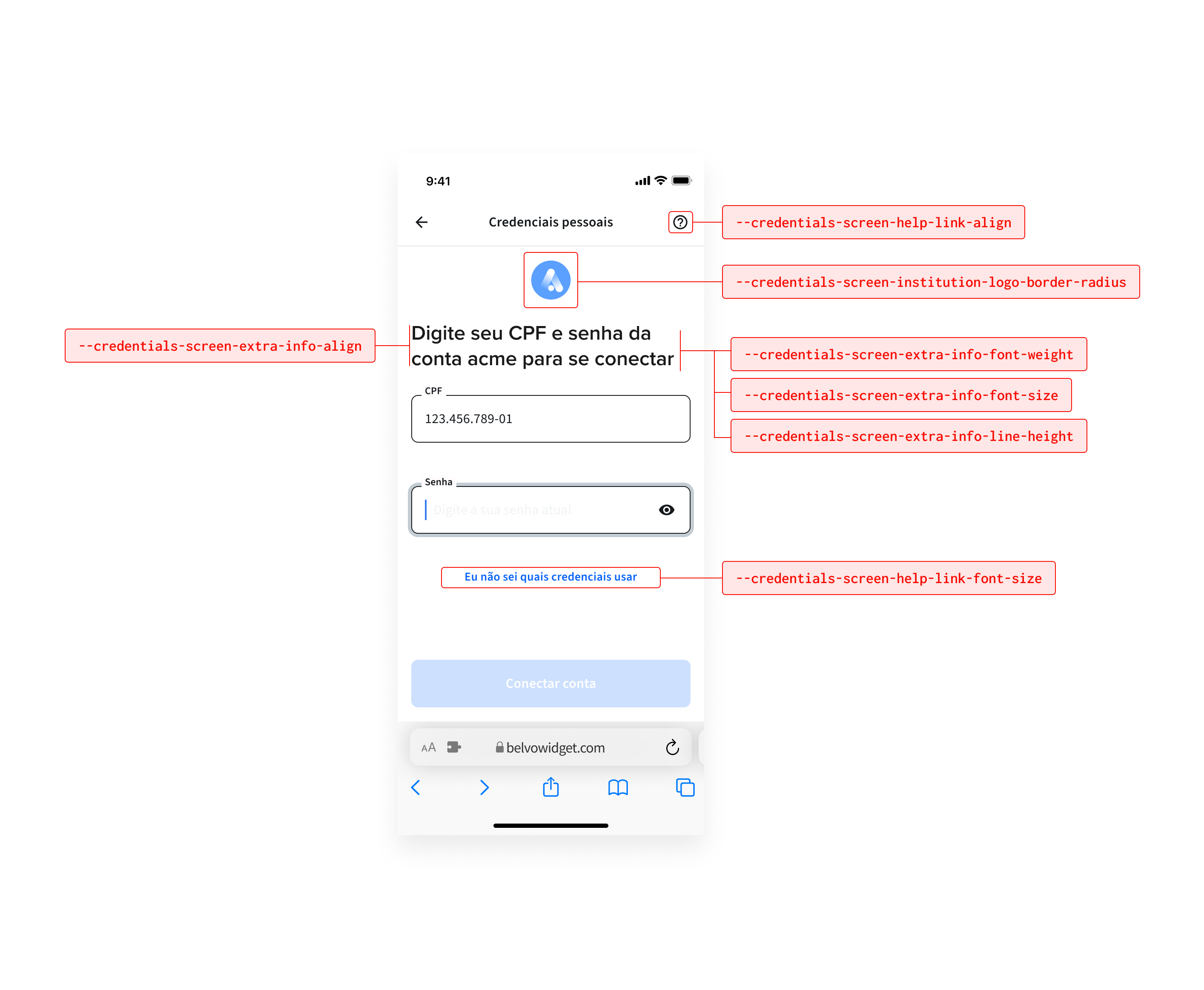
| CSS Variable | Default (Light) | Default (Dark) | Description |
|---|---|---|---|
--credentials-screen-institution-logo-border-radius | 8px | 8px | Defines the institution logo border radius in the credentials screen. |
--credentials-screen-header-logo-reversed | false | false | Reverses institution logo and header (title/extra info) order when set to true. |
--credentials-screen-help-link-align | center | center | Sets help link alignment in the credentials screen. Possible values are: start, center, and end. |
--credentials-screen-help-link-font-size | 14px | 14px | Sets the help link font size in the credentials screen. |
--credentials-screen-counter-border-radius | 8px | 8px | Defines the border radius for the credentials screen counter. |
--credentials-screen-counter-font-size | 14px | 14px | Sets the font size for the credentials screen counter. |
To modify the widget credentials screen:
- Add the
themearray to thewidgetobject. - For each item you want to modify, add an object that has the keys
css_keyandvalue.
{
  "widget": {
    "branding": {}, // Your customized branding
    "theme": [
      {
        "css_key": "--credentials-screen-institution-logo-border-radius",
        "value": "100px"
      },
      {
        "css_key": "--credentials-screen-header-logo-reversed",
        "value": "true"
      },
      {
        "css_key": "--credentials-screen-help-link-align",
        "value": "start"
      },
      {
        "css_key": "--credentials-screen-help-link-font-size",
        "value": "12px"
      },
      {
        "css_key": "--credentials-screen-counter-border-radius",
        "value": "20px"
      },
      {
        "css_key": "--credentials-screen-counter-font-size",
        "value": "12px"
      }
    ]
  }
}You can customize the widget's input fields to suit your brand's needs:
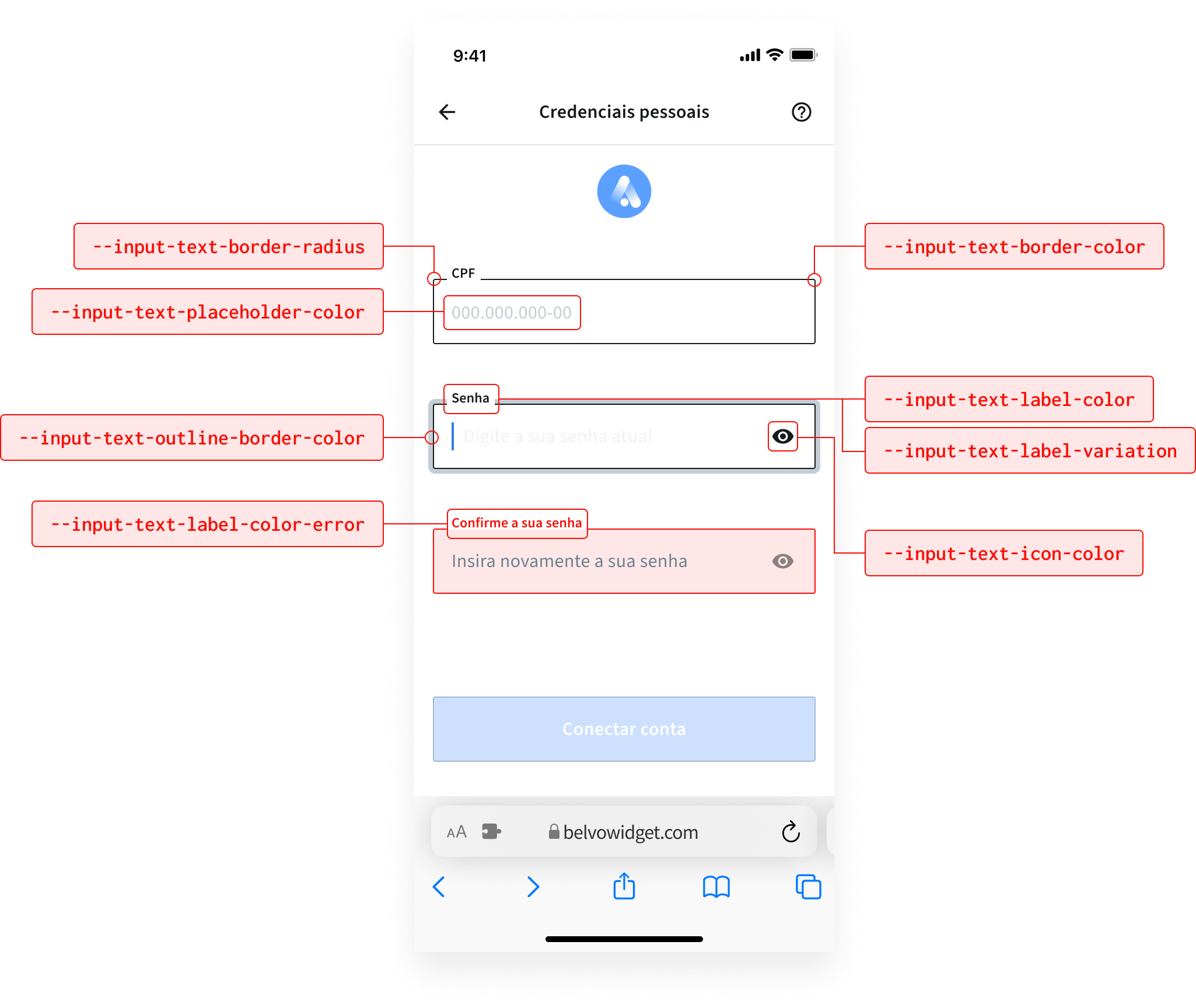
The possible modifications are listed in the table below:
| CSS Variable | Default (Light) | Default (Dark) | Description |
|---|---|---|---|
--input-text-border-radius | 2px | 2px | Defines the border radius for input fields. |
--input-text-border-color | #161a1d | #2B3D54 | Specifies the border color for input fields. |
--input-text-outline-border-color | #c4cdd4 | #3A4D64 | Defines the outline border color for input fields. (like hover effect) |
--input-text-placeholder-color | #c4cdd4 | #2B3D54 | Defines the color for placeholder text. |
--input-text-label-color | #414d58 | #EEF3F8 | Sets the label color for input fields. |
--input-text-label-color-error | #f90e06 | #E04A39 | Specifies the label color for input fields in error state. |
--input-text-label-variation | outlined | outlined | Specifies label variation position. Possible options are: outlined and top. |
--input-text-icon-color | #000000 | #E04A39 | Sets the color of input icons. |
To modify the widget's input fields:
- Add the
themearray to thewidgetobject. - For each item you want to modify, add an object that has the keys
css_keyandvalue(see the code sample below). The color values can be either in HEX, RGB, or RGBA format.
{
  "widget": {
    "color_scheme": "LIGHT",
    "branding": {}, // Your customized branding
    "theme": [
      {
        "css_key": "--input-text-border-radius",
        "value": "2px"
      },
      {
        "css_key": "--input-text-border-color",
        "value": "#161a1d"
      },
      {
        "css_key": "--input-text-outline-border-color",
        "value": "#c4cdd4"
      },
      {
        "css_key": "--input-text-placeholder-color",
        "value": "#c4cdd4"
      },
      {
        "css_key": "--input-text-label-color",
        "value": "#414d58"
      },
      {
        "css_key": "--input-text-label-color-error",
        "value": "#f90e06"
      },
      {
        "css_key": "--input-text-label-variation",
        "value": "outlined"
      },
      {
        "css_key": "--input-text-icon-color",
        "value": "#000000"
      }, // Add additional theming options here
    ]
  }
}You can customize the widget's tabs to suit your brand's needs:
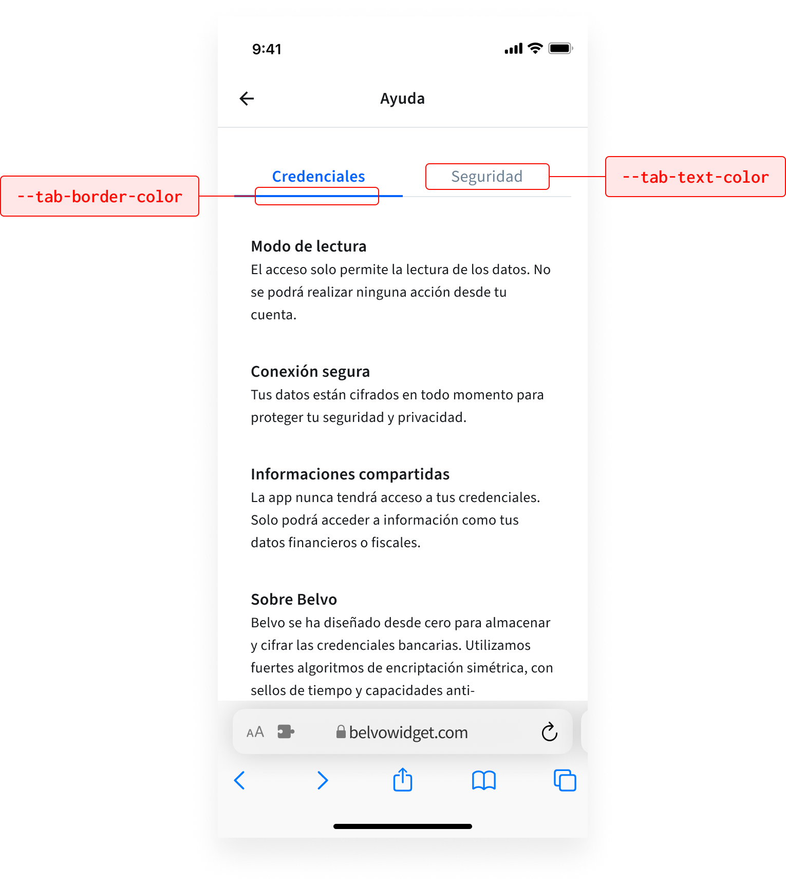
The possible modifications are listed in the table below:
| CSS Variable | Default (Light) | Default (Dark) | Description |
|---|---|---|---|
--tab-text-color | #0663f9 | #0663f9 | Defines the text color for the tabs. |
--tab-border-color | #0663f9 | #0663f9 | Specifies the border color for the bottom of the tabs. |
To modify the widget's tabs:
- Add the
themearray to thewidgetobject. - For each item you want to modify, add an object that has the keys
css_keyandvalue(see the code sample below). The color values can be either in HEX, RGB, or RGBA format.
{
  "widget": {
    "color_scheme": "LIGHT",
    "branding": {}, // Your customized branding
    "theme": [
      {
        "css_key": "--tab-text-color",
        "value": "#0663f9"
      },
      {
        "css_key": "--tab-border-color",
        "value": "#0663f9"
      }, // Add additional theming options here
    ]
  }
}