With Belvo's Pix Biometria Widget, you can optionally add the following branding and customization:
You can specify which institutions are initially displayed in the widget by providing a list of up to 5 preferred institutions. Users will still be able to search for other institutions beyond those you specify.
Instructions
To set the institutions to display:
- Add the
top_tier_institutionsparameter to thewidgetobject. - Provide an array of 1 to 5 institution identifiers from the available list.
- The institutions will display in the order you provide them in the array.
{
  "use_cases": ["ENROLLMENT", "PAYMENT_INTENT"],
  "widget": {
    // Other parameters...
    "top_tier_institutions": [ "nubank_retail", "picpay_retail", "mercadopago_retail", "itau_retail"]
  }
}
If you do not pass this parameter, the widget will display all available institutions.
For a list of available institutions, please see the top_tier_institutions parameter in our API Reference.
Once you set the color_scheme, you can add additional customizations to individual elements of the widget (see the detailed sections below). You do not have to include all the possible css_keys. You can just set the keys (and values) that you want to modify
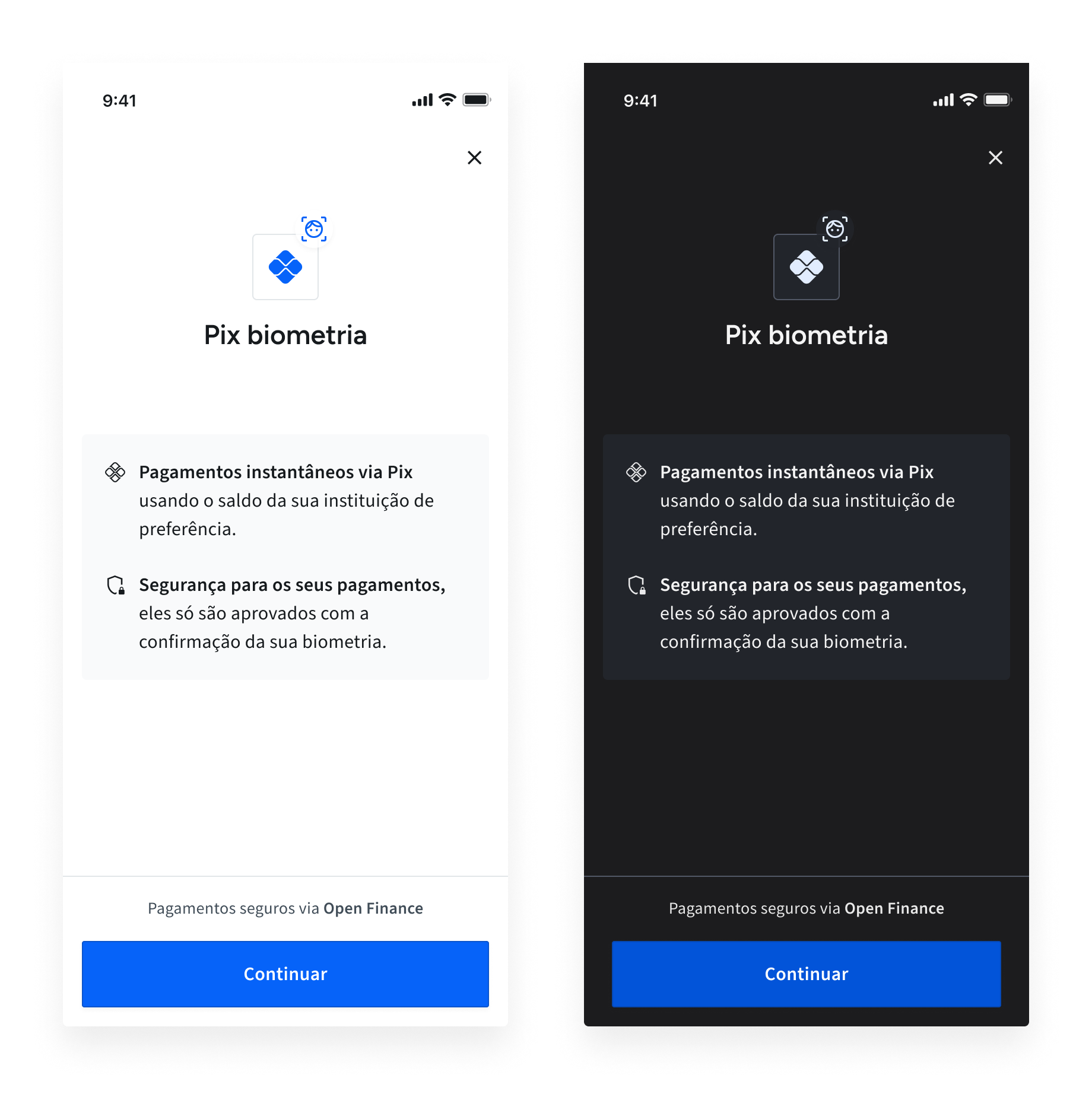
You can set whether the widget should display in a light or dark color scheme. By default, the widget will start in LIGHT color scheme. The widget's color scheme does not automatically change according to the user's system settings.
Instructions
To add your set which theme you want, just add either LIGHT or DARK to the color_scheme key in the branding object:
{
  "widget": {
    "branding": {
      ...
      "color_scheme": "LIGHT",
      ...
        }
     }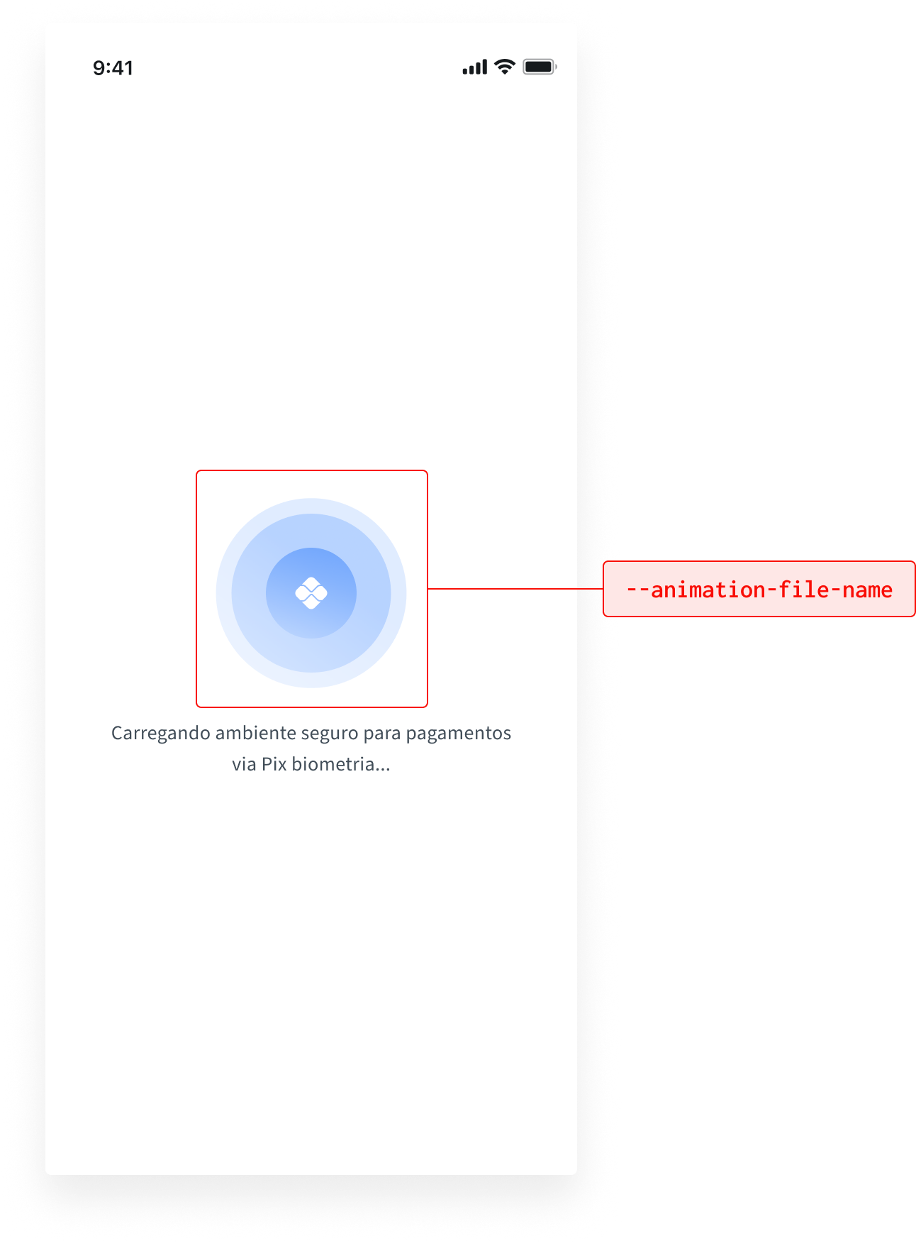
}You can add a custom animation to display when the widget starts. The file type is a 144px x 144px Lottie animation (you can find more details in the specification here or view some examples here). You will need to first share the file with Belvo so that we can ensure that it will load correctly in the widget.
To modify the widget's primary colors:
- Add the
themearray to thewidgetobject. - For each item you want to modify, add an object that has the keys
css_keyandvalue(see the code sample below).
{
  "widget": {
    "branding": {}, // Your customized branding
    "theme": [
      {
        "css_key": "--animation-file-name",
        "value": "name_of_file_shared_with_belvo"
      }, // Add additional theming options here
    ]
  }
}
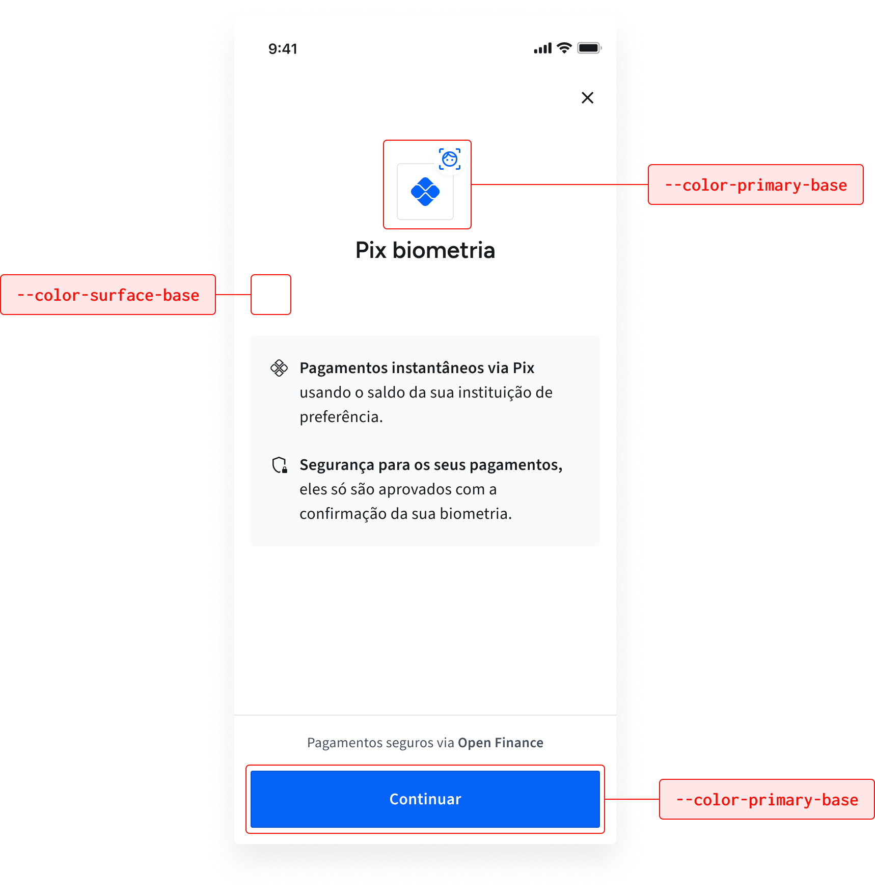
You can customize the color scheme by modifying the primary active and background colors
| CSS Variable | Default (light) | Default (dark) | Description |
|---|---|---|---|
--color-primary-base | #0663f9 | #0254D9 | Sets the active color for the navigation bar 'stepper'. |
--color-surface-base | #FFFFFF | 1C1C1E | Sets the inactive color for the navigation bar 'stepper'. |
To modify the widget's primary colors:
- Add the
themearray to thewidgetobject. - For each item you want to modify, add an object that has the keys
css_keyandvalue(see the code sample below). The color values can be either in HEX, RGB, or RGBA format.
{
  "widget": {
    "branding": {}, // Your customized branding
    "theme": [
      {
        "css_key": "--color-primary-base",
        "value": "#0663f9"
      },
      {
        "css_key": "--color-surface-base",
        "value": "#FFFFFF"
      }, // Add additional theming options here
    ]
  }
}
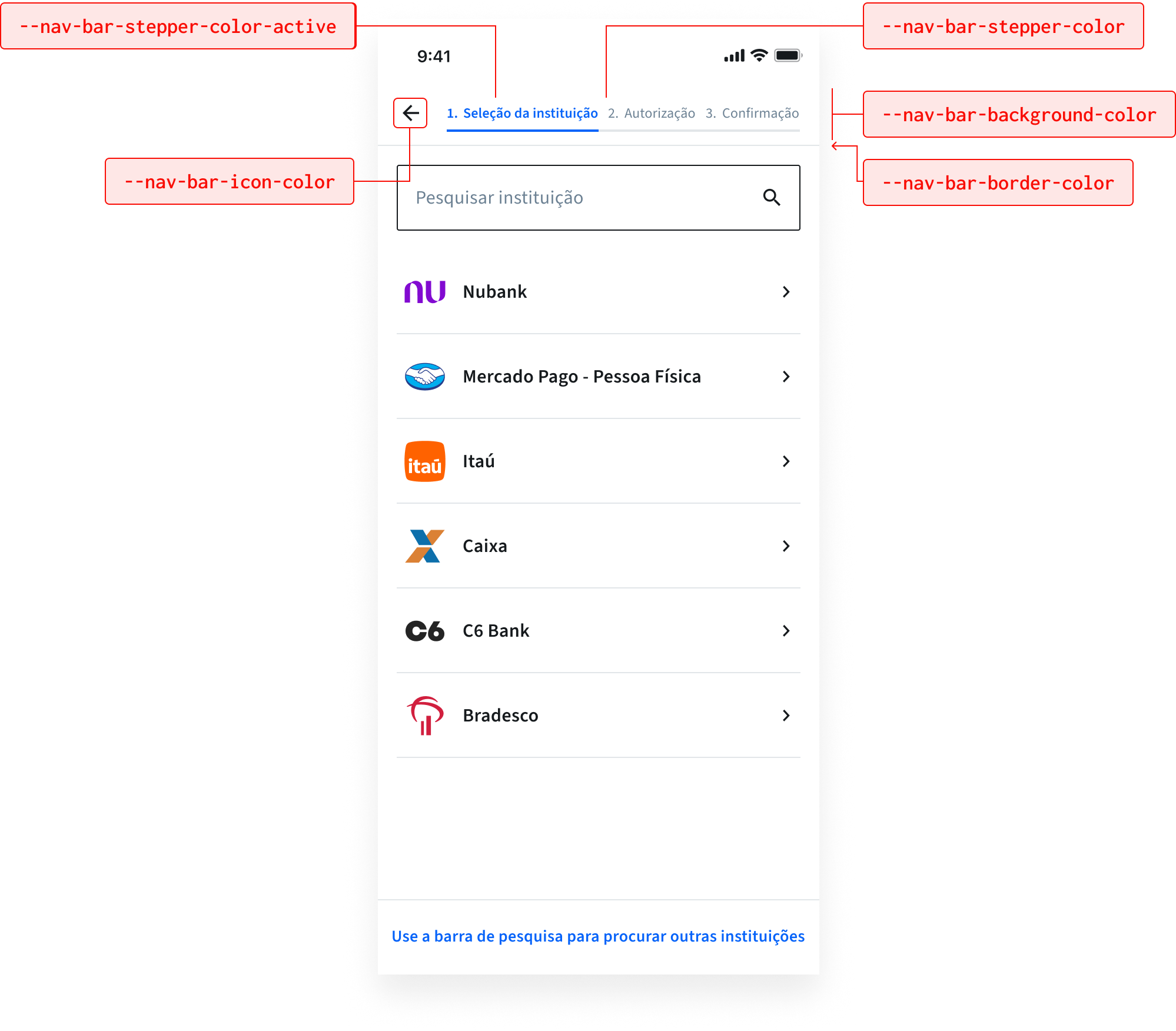
You can customize the widget's navigation bar by modifying the colors to suit your brand's needs:
The possible modifications are listed in the table below:
| CSS Variable | Default (light) | Default (dark) | Description |
|---|---|---|---|
--nav-bar-stepper-color-active | #0663F9 | #E1ECFE | Sets the active color for the navigation bar 'stepper'. |
--nav-bar-stepper-color | #6C8193 | #FFFFFF with 90% opacity | Sets the inactive color for the navigation bar 'stepper'. |
--nav-bar-icon-color | #161A1D | #FFFFFF with 90% opacity | Sets the color of navigation bar icons. |
--nav-bar-background-color | #FFFFFF | #1C1C1E | Defines the background color of the navigation bar. |
--nav-bar-border-color | #E2E6E9 | #525866 | Specifies the border color of the navigation bar. |
To modify the widget's navigation bar:
- Add the
themearray to thewidgetobject. - For each item you want to modify, add an object that has the keys
css_keyandvalue(see the code sample below). The color values can be either in HEX, RGB, or RGBA format.
{
  "widget": {
    "branding": {}, // Your customized branding
    "theme": [
      {
        "css_key": "--nav-bar-stepper-color-active",
        "value": "#0663F9"
      },
      {
        "css_key": "--nav-bar-stepper-color",
        "value": "#6C8193"
      },
      {
        "css_key": "--nav-bar-icon-color",
        "value": "#161A1D"
      },
      {
        "css_key": "--nav-bar-background-color",
        "value": "#FFFFFF"
      },
      {
        "css_key": "--nav-bar-border-color",
        "value": "#E2E6E9"
      }, // Add additional theming options here
    ]
  }
}
You can customize the widget's buttons by modifying the colors and border radiuses to suit your brand's needs:
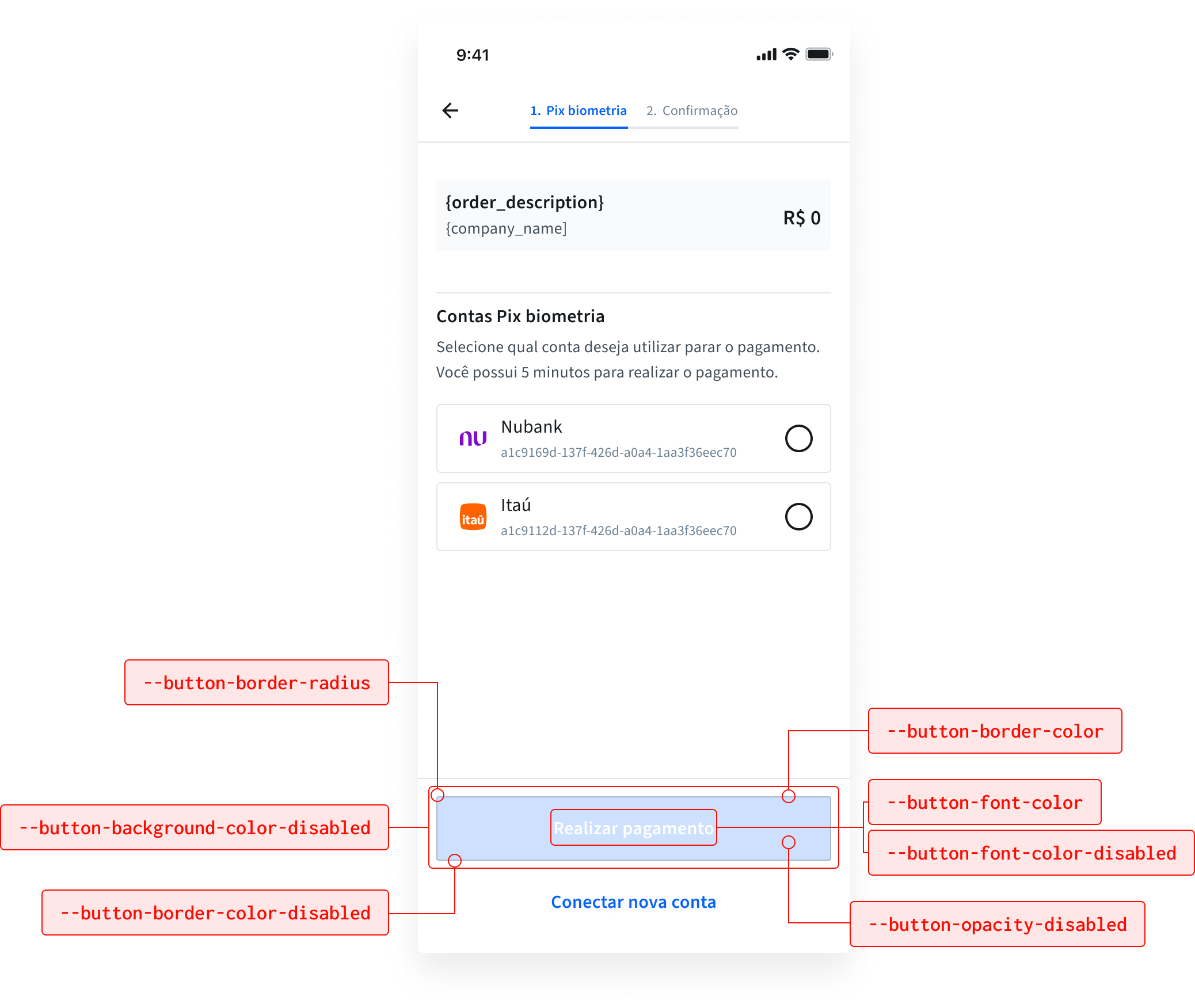
The possible modifications are listed in the table below:
| CSS Variable | Default (light) | Default (dark) | Description |
|---|---|---|---|
--button-font-color | #ffffff | #ffffff | Sets the font color for buttons. |
--button-font-color-disabled | #ffffff | #ffffff with 90% opacity | Defines the font color for disabled buttons. |
--button-border-radius | 2px | 2px | Specifies the border radius of buttons. |
--button-background-color-disabled | #009EE3 | #2B303B | Defines the background color for disabled buttons. |
--button-opacity-disabled | 0.2 | 0.2 | Specifies the opacity for disabled buttons. |
--button-border-color-disabled | #CDE0FE | #525866 | Sets the border color for disabled buttons. |
To make modifications to the widget's buttons:
- Add the
themearray to thewidgetobject. - For each item you want to modify, add an object that has the keys
css_keyandvalue(see the code sample below). The color values can be either in HEX, RGB, or RGBA format.
{
  "widget": {
    "branding": {}, // Your customized branding
    "theme": [
      {
        "css_key": "--button-font-color",
        "value": "#ffffff"
      },
      {
        "css_key": "--button-font-color-disabled",
        "value": "#ffffff"
      },
      {
        "css_key": "--button-border-radius",
        "value": "2px"
      },
      {
        "css_key": "--button-background-color-disabled",
        "value": "#009EE3"
      },
      {
        "css_key": "--button-opacity-disabled",
        "value": "0.2"
      },
      {
        "css_key": "--button-border-color-disabled",
        "value": "#CDE0FE"
      },
    ]
  }
}
You can customize the widget's selector fields to suit your brand's needs:
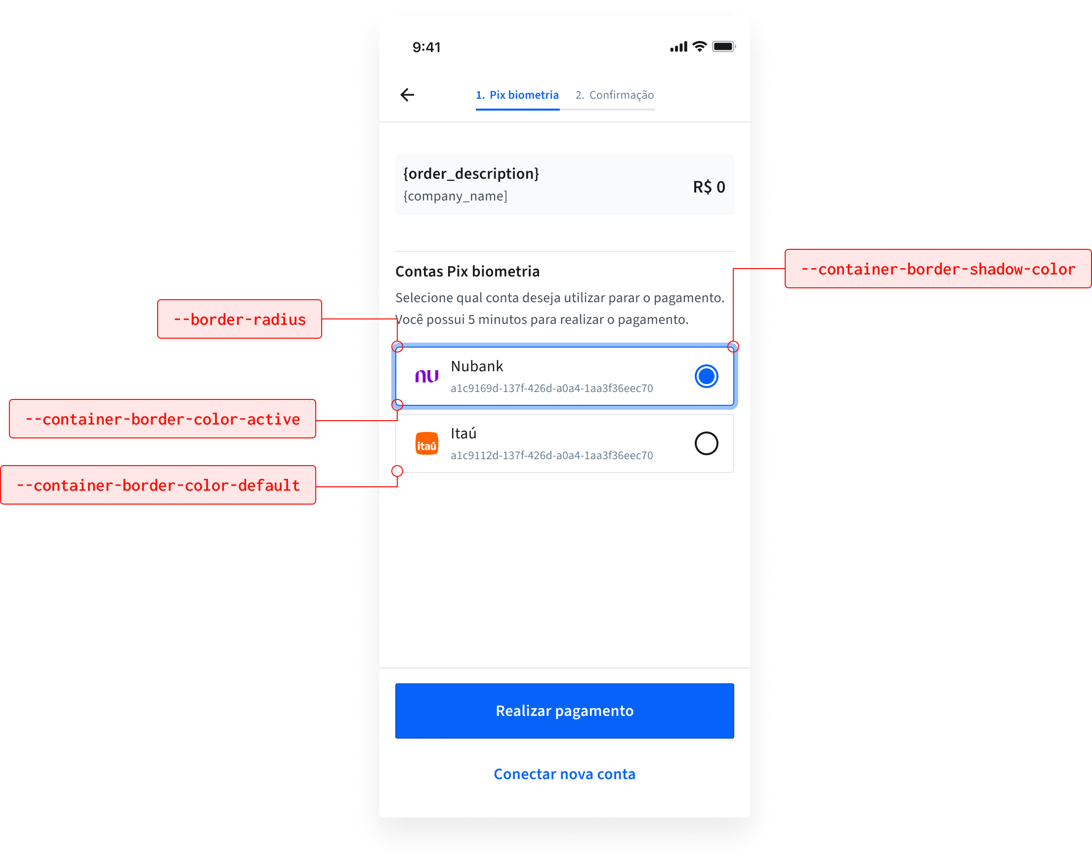
The possible modifications are listed in the table below:
| CSS Variable | Default (light) | Default (dark) | Description |
|---|---|---|---|
--border-radius | 2px | 2px | The radius of the button selector. |
--container-border-color-active | #0663F9 | #0254D9 | The color of the active selection. |
--container-border-color-default | #E2E6E9 | #525866 | The color of the inactive selection. |
--container-border-shadow-color | #9CC1FC | #9CC1FC | The shadow for the active selection. |
To modify the widget's selector fields:
- Add the
themearray to thewidgetobject. - For each item you want to modify, add an object that has the keys
css_keyandvalue(see the code sample below). The color values can be either in HEX, RGB, or RGBA format.
{
  "widget": {
    "branding": {}, // Your customized branding
    "theme": [
      {
        "css_key": "--border-radius",
        "value": "2px"
      },
      {
        "css_key": "--container-border-color-active",
        "value": "#0663F9"
      },
      {
        "css_key": "--container-border-color-default",
        "value": "#E2E6E9"
      },
      {
        "css_key": "--container-border-shadow-color",
        "value": "#9CC1FC"
      }
      }, // Add additional theming options here
    ]
  }
}
You can customize the widget's banners to suit your brand's needs:
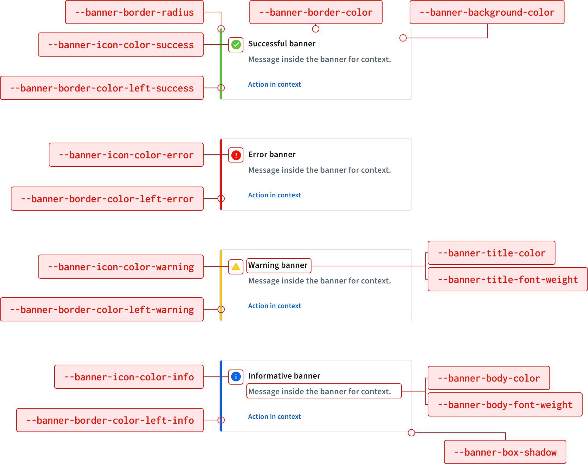
The possible modifications are listed in the table below:
| CSS Variable | Default (light) | Default (dark) | Description |
|---|---|---|---|
--banner-border-radius | 4px | 4px | Specifies the border radius of banners. |
--banner-background-color | #ffffff | #22252B | Sets the background color of banners. |
--banner-border-color | #e2e6e9 | #e2e6e9 | Specifies the border color of banners. |
--banner-border-color-left-error | #f90e06 | #f90e06 | Left border color for error banners. |
--banner-border-color-left-success | #59c837 | #59c837 | Left border color for success banners. |
--banner-border-color-left-info | #0663F9 | #0663F9 | Left border color for info banners. |
--banner-border-color-left-warning | #f9c806 | #f9c806 | Left border color for warning banners. |
--banner-icon-color-error | #f90e06 | #f90e06 | Icon color for error banners. |
--banner-icon-color-success | #59c837 | #59c837 | Icon color for success banners. |
--banner-icon-color-info | #0663F9 | #0663F9 | Icon color for info banners. |
--banner-icon-color-warning | #f9c806 | #f9c806 | Icon color for warning banners. |
--banner-title-color | #161a1d | #FFFFFF with 95% opacity | Sets the color of banner titles. |
--banner-body-color | #414d58 | #FFFFFF with 90% opacity | Specifies the color of banner body text. |
--banner-title-font-weight | 600 | 600 | Defines the font weight of banner titles. |
--banner-body-font-weight | 600 | 600 | Specifies the font weight of banner body text. |
--banner-box-shadow | 0 2px 4px 0 rgba(0, 0, 0, 0.05) | #0 2px 4px 0 rgb(82,88,102) | Adds a shadow effect to banners. |
To make modifications to the widget's banners:
- Add the
themearray to thewidgetobject. - For each item you want to modify, add an object that has the keys
css_keyandvalue(see the code sample below). The color values can be either in HEX, RGB, or RGBA format.
{
  "widget": {
    "branding": {}, // Your customized branding
    "theme": [
      {
        "css_key": "--banner-border-radius",
        "value": "4px"
      },
      {
        "css_key": "--banner-background-color",
        "value": "#ffffff"
      },
      {
        "css_key": "--banner-border-color",
        "value": "#e2e6e9"
      },
      {
        "css_key": "--banner-border-color-left-error",
        "value": "#f90e06"
      },
      {
        "css_key": "--banner-border-color-left-success",
        "value": "#59c837"
      },
      {
        "css_key": "--banner-border-color-left-info",
        "value": "#0663F9"
      },
      {
        "css_key": "--banner-border-color-left-warning",
        "value": "#f9c806"
      },
      {
        "css_key": "--banner-icon-color-error",
        "value": "#f90e06"
      },
      {
        "css_key": "--banner-icon-color-success",
        "value": "#59c837"
      },
      {
        "css_key": "--banner-icon-color-info",
        "value": "#0663F9"
      },
      {
        "css_key": "--banner-icon-color-warning",
        "value": "#f9c806"
      },
      {
        "css_key": "--banner-title-color",
        "value": "#161a1d"
      },
      {
        "css_key": "--banner-body-color",
        "value": "#414d58"
      },
      {
        "css_key": "--banner-title-font-weight",
        "value": "600"
      },
      {
        "css_key": "--banner-body-font-weight",
        "value": "600"
      },
      {
        "css_key": "--banner-box-shadow",
        "value": "0 2px 4px 0 rgba(0, 0, 0, 0.05)"
      },
    ]
  }
}
You can add your company name to be displayed when the widget first starts.
Instructions
To add your company name, just add it to the company_name key in the branding object.
{
  "widget": {
    "branding": {
      ...
      "company_name": "ACME",
      ...
        }
     }
}